Charting
The charting option is designed to be a way of quickly adding a single chart to a report. Saved Crosstabs can be imported into Dashboards and Pages if multiple charts are required.
A real-time preview of the Crosstab report is always shown at the bottom of the screen.
Standard Options
-
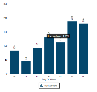
Chart Type (drop-down list): Select the chart to display. The list displays all the charts that are relevant to the data currently added to the Crosstab grouped by the following Chart Types:
- Position (drop-down list): Select an option for controlling where the chart will display.
- Table
- Table and Chart – Side by side
- Table and Chart (Tiled) –Toggle between a table and chart
- Table over Chart – Stacked
- Chart
- Chart and Table – Side by side
- Chart and Table (Tiled) – Toggle between a chart and table
- Chart over Table – Stacked
-
Width/Height: Customise the chart size in pixels.
Tip: This only has to be set once and can be cached in the browser.
- X/Y Axis Label: Change the default axis labels.
- Chart Columns: This option reverses the axis being charted.
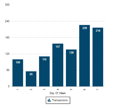
- Show Animation (checkbox): Enable or disable the chart animation.
- Show Gradient (checkbox): Add a gradient to the colour of a chart.
- Format Number Scale (checkbox): Toggle the representation of thousands as ‘K’ and millions as ‘M’.
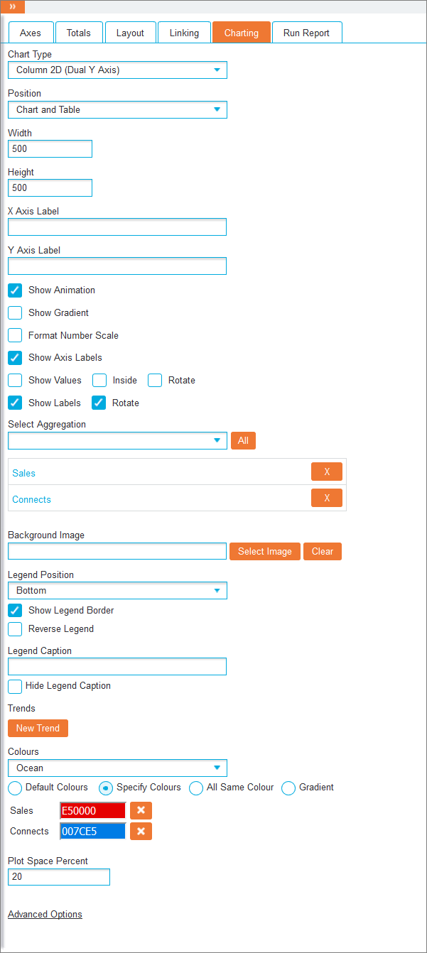
- Show Axis Labels (checkbox): This option controls whether axis labels are displayed
-
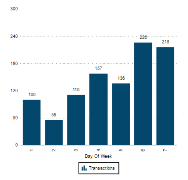
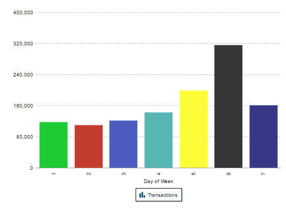
Show Values (checkbox): This set of option allows you to display numbers on a chart. The first checkbox shows values horizontally.

Checking Inside option shows values inside the bars of a bar chart.

And checking Rotate option shows values vertically.

- Show Labels: This set of options work in the same way as described above for Show Values, but impacts axis labels.
- Select Aggregation (drop-down list): Choose the aggregations that will be charted. To remove, click the X icon next to the relevant aggregation. The Use Totals As Axis option becomes available when using a multi-series chart type with more than one aggregation and allows the use of aggregations as the axis labels.
- Background Image: Click the Select Image button to select in image for the background of the chart or the Clear button to remove it.
- Line Weight: When using line or spline charts, the provided number specifies the thickness of chart lines, with a higher number producing thicker lines.
- Legend Position (drop-down list): Select Bottom (default) or Right to reposition the chart legend or Hiddento hide it.
- Show Legend Border (drop-down list): It can be used to hide or display the box that surround the legend.
- Reverse Legend (drop-down list): By checking this option, the legend values will be displayed in reverse alphabetical order.
- Legend Caption: Type the text to be shown at the top of the legend.
- Hide Legend Caption (checkbox): Check this option to disable the entered caption rather than deleting it from the textbox, allowing it to be quickly re-enabled once required.
- Colours (drop-down list): Select a predefined colour scheme theme to be applied to the chart.
- <Colour choices>: One of the following radio buttons can be selected:
- Default Colours: It will use the predefined colours
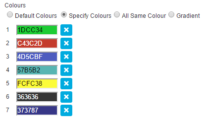
Specify Colours: This allows a colour choice for each aggregation in the chart by typing in the hex code or selecting a colour from the pop-up box. When configuring line charts, click the Dashed (checkbox) next to the corresponding aggregation to display lines as dashes. Delete colours with the relevant X icon.


- All Same Colour: Displays aggregations without colour differentiation
- Gradient: Applies a colour gradient to all aggregations
- Plot Space Percent: Type a value to alter the spaces between bars in a bar chart. The larger the value, the wider the space between values.
Advanced Options
Clicking Advanced Options allows you to override the axis scale to enable better comparison between similar charts. If a Dual Y Axis chart is used, a second scale option will also be exposed to the user.
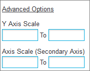
Set the minimum and maximum displayed axis values using the Axis Scale textboxes.
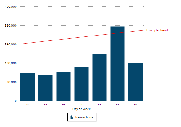
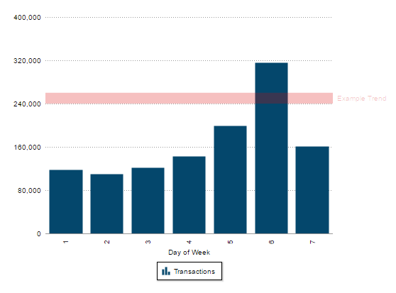
Trends
It is possible to add one or more trend lines or zones to a chart by clicking the New Trend button.
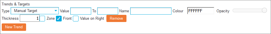
- Value/To: Enter values to specify the range
- Name: Enter a label for the trend
- Colour: Change the colour of the trend by typing in the hex code or by selecting a colour from the pop-up box
- Opacity (slider): Customise the transparency of the colour to define how prominently the trend will appear over the chart
- Thickness: If using a trend line, type a value to edit the width of resulting line (not zone)
-
Zone (checkbox): Toggles between a trend line and trend zone
 (Trend Line)
 (Trend Zone)
 - Front (checkbox): Allows you to render the trend in front or behind the chart data
- Value on Right (checkbox): Enable this to display text entered in the Name textbox to the right of the trend to avoid obscuring axis values
Colour Palettes
When a colour palette is configured, charts will automatically adopt the palette when the fields specified in the palette are present in the Crosstab.