Layout
This tab allows you to customize the appearance and style of your tables.
 Table options
The table options allow results table to be presented in a variety of customisable ways:
| Options | Values | Description |
|---|---|---|
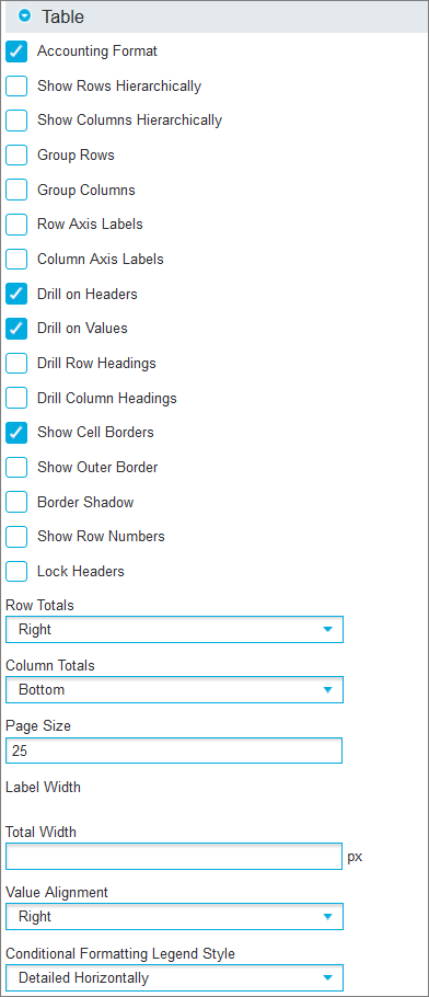
| Accounting Format | Uses brackets to symbolise negative values. The default value is set to on. | |
| Include Subtotals in Report | Sets whether to display subtotals. This option will only be available if the Crosstab contains nested rows. | |
| Force Subtotals | Displays a subtotal even if there is only a single value to subtotal. | |
| Filter Totals | Only appears when the Crosstab data has been filtered using the Filter tab. By default, the grand total for a filtered Crosstab will display the grand total for all data. The Filter Totals option will display the grand total of just the filtered values. | |
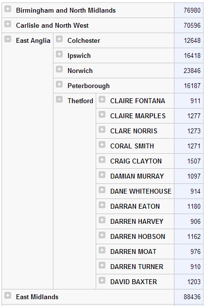
| Show Rows Hierarchically |
Expands and collapses nested rows using the + icon.
|
|
| Show Columns Hierarchically | Expands and collapses nested columns using the + icon. | |
| Group Rows |
Drills down to next level of using the + icon. Use the group breadcrumbs header/footer option to assist with navigation.
|
|
| Group Columns | Drills down to next level by using the + icon. Use the group breadcrumbs header/footer option to assist with navigation. | |
| Row Axis Labels | Shows the field names as row axis labels in the table. | |
| Column Axis Labels | Shows the field names as column axis labels in the table. | |
| Drill on Headers | Enables/disables the ability to subset data by clicking on the column/row header. | |
| Drill on Values | Enables/disables the ability to drill through to the actual data by clicking on the cell values. | |
| Show Cell Borders | Shows or hides borders around Crosstab cells. | |
| Show Outer Border | Shows or hides borders around the Crosstab. | |
| Show Row Numbers | Shows or hides row numbers on the Crosstab. | |
| Lock Headers | Locks headers when large Crosstabs scroll off-screen. | |
| Drill Row Headings | Enables/disables the ability to drill through row headings by clicking on them. | |
| Drill Column Headings | Enables/disables the ability to drill through column headings by clicking on them. | |
| Row Totals | None | Hides the Row Totals. |
| Left | Moves the Row Totals to the left of the table. | |
| Right | Moves the Row Totals to the right of the table (Default). | |
| Both | Displays the Row Totals to the left and right of the table. | |
| Column Totals | None | Hides the Column Totals. |
| Top | Moves the Column Totals to the top of the table. | |
| Bottom | Moves the Column Totals to the bottom of the table (Default). | |
| Both | Displays the Column Totals at top and bottom of the table. | |
| Separate | Displays the Column Totals as a separate table above the main table. | |
| Page Size |
The report can be split into pages by setting the number of rows to be displayed on a single page. This can apply to the configuration of both tables and charts. If used when nested rows are configured, only the highest level is counted. |
|
| Label Width |
This allows the label width to be fixed rather than dynamic. If you are using nested rows, you can set the size of each row individually. |
|
| Total Width |
This allows the total width to be fixed rather than dynamic. |
|
| Value Alignment | Left | Aligns the Cell values to the left. |
| Centre | Aligns the Cell values centrally. | |
| Right | Aligns the Cell values to the right (Default). | |
| Conditional Formatting Legend Style | Detailed Horizontally | Displays each aggregation legend side by side in the header or footer. |
| Detailed Vertically | Displays each aggregation legend one above the other in the header or footer. | |
| Summary | Outputs the aggregations conditional formatting legend as a simple example and description. |
 Header options
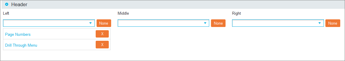
The header options allow labels to be added to the top of a report. The following labels can be added to the Left, Middle or Right of the report:
| Label | Description |
|---|---|
| Column Size | Shows a count of the number of columns in the table. |
| Conditional Formatting Description | Shows the conditional formatting legend. |
| Date Time | Shows the date and time when the report was saved. |
| Description | The description given to the saved report. |
| Drill Through Menu | Displays the drill through menu used for linking between reports. If there are no linked reports, this option is hidden. |
| Filters: (name) | Shows any form field values. Form Fields can be individually positioned by selecting each filter by name. |
| Group Breadcrumbs | Used in conjunction with the Group Layout option. Displays navigation assistance for grouped Crosstabs. |
| Image | Upload an image to be used as a header. |
| Index | The Index name against which the report has been created. |
| Name | The name of the saved report. |
| Page Numbers | Shows the page n umber in the header. If the report is only a single page, this option is hidden. |
| Query | Shows any query contained within the Search Bar. |
| Row Size | Shows a count of the number of rows in the table. |
| Switch Axis | Shows the Show Axis button in the header. |
| Table Controls | Allows access to temporarily edit the Sort Rows, Sort Columns and Filter options after a Crosstab has been run. |
| User | Displays the name of the user that has executed the report. |
| User Field 1-3 | Free text fields which can be completed in the Custom Labels section. |
Levels options
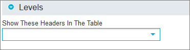
The Levels option allows you to hide any level of axis heading. Select the desired headers on the Show These Headers In The Table drop-down list. Click the X icon next to the desired field to remove it. The underlying logic will still be applied to the report as only the heading values are removed.
Footer options

Footers behave in the same way as headers but are displayed at the bottom of the report.
Custom Labels options
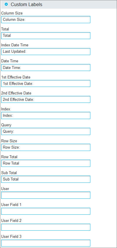
Labels can be renamed from the default values if required. To edit, use the textbox under the corresponding label. The User Field textboxes allow custom text to be displayed in a report.
Style options
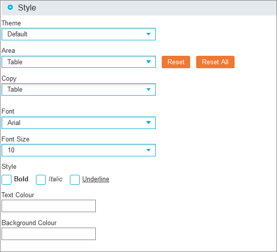
By default, Crosstabs are displayed using a printer-friendly, plain layout. The styling options allow complete customisation over the appearance:
- Theme (drop-down list): Select the colour scheme that will apply to the entire Crosstab. Disable this option by choosing Default from the drop-down list.
-
Area (drop-down list): Select a specific section of the Crosstab for customisation. The Top Left option allows the use of an image or separate formatting of the empty space displayed at the top left of a Crosstab while all other options refer to specific values or locations.
Click the Reset button to delete any changes for the currently selected Area, or click Reset All to remove all styling changes.
- Copy (drop-down list): Select an option to quickly duplicate changes across multiple areas. First select from the Area drop-down list the section to be styled, then select from the Copy drop-down list the section to be copied.
- Font (drop-down list): Select the font to be used
- Font Size (drop-down list): Select the font size to be used
- Style (checkboxes): Select Bold, Italic and/or Underline
- Text/Background Colour: Select a colour from the pop-up box or type its hex code
Drill Through options
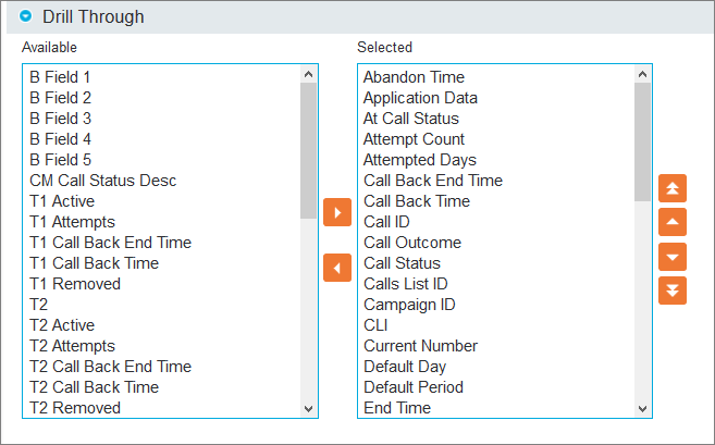
The Drill Through options allow you to configure the displayed fields and the order of the Query columns that appear after drilling through on the report. This allows you to change the default layout and setup a customised layout for the data for each individual report.
Move fields between the Available and Selected boxes with the left and right arrows and rearrange the items of the Selected box with the Up and Down arrows.