Component Options
Clicking an added component will reveal a number of options in the toolbox.
| Icon | Description | ||||||||
|---|---|---|---|---|---|---|---|---|---|
|
Opens the relevant component configuration screen. |
||||||||
|
If a chart or gauge is selected, this option swaps to the Crosstab table view of the data and vice versa. |
||||||||
|
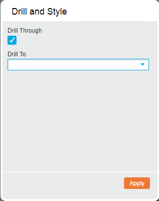
Shows the 'Drill and Style' dialog box with a number of options.
Once the desired options have been set, click the Apply button to save any changes made and return to the report. |
||||||||
|
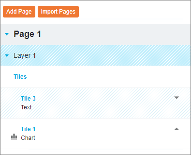
Adds an additional tile to the page, allowing multiple components to be layered on top of each other and displayed in Run mode. When added, the Tiles heading is displayed below the component name in the 'Pages' tab on the navigation panel. The original component will be displayed under Tile 1.
Click Tile 2 and drag a component to its space on the page to add it to the new tile.  Tiles Options Tiles Options
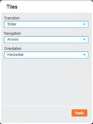
Clicking the Tiles heading in the 'Pages' tab shows additional Tiles Options on the toolbox.
To remove an empty tile, select it in the 'Pages' tab and click the |
||||||||
|
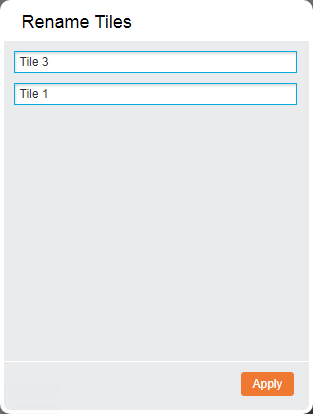
Change the name of the added component in the Name textbox.
Click Apply to save the change. |
||||||||
|
Make the background of the component transparent. |
||||||||
|
Using this option you can link components to a master component. If the master component is drilled through or changed in Run mode, the linked component is then filtered by the same value. Once the Create Link option is clicked, a blue link icon and number will be displayed next to the component name, indicating its master component status. Drag this icon onto the desired components to create the links. Linked components will display a red link icon next to their name. To remove a link, click the relevant icon and click Remove Link. Removing a master component’s link status will remove all associated links. |
||||||||
|
Delete the component from the page and move it to the 'Unused' section of the navigation panel to be quickly added back to the page, if required. | ||||||||
|
Removes the component from the entire report. |
||||||||
|
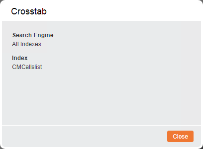
Displays a pop-up window with information about the Search Engine and the Index.
|
 icon on the 'Tile Options' section of the toolbox.
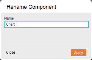
Layout
When an added Crosstab or Query component is clicked, a number of layout options become available that dictate how the component will be scaled on the page.
| Icon | Description |
|---|---|
|
The content is resized according to how large the component is on the page so that all information is displayed. |
|
The report is scaled based on width. |
|
The report is scaled based on height. |
|
Nothing is resized and the contents are not fully displayed unless the component is made large enough. |