Axes
In this tab, the fields for the rows and columns can be selected.
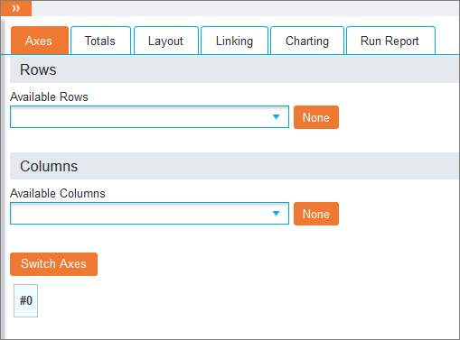
Use the drop-down list to select fields below the Available Rows and Available Columns headings to populate the Crosstab. All fields made available by the system administrator in the currently loaded Index are available. Additionally you can use a saved Query as a row or column, by selecting the Saved option at the bottom of the drop-down list.
 Use saved query as row or column

Then click the ellipsis (…) next to the new Saved field that appears and Select Reports to choose a Query.
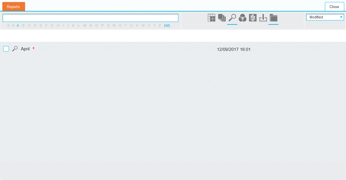
Check the box next to the desired queries to import and click the 'Selected Reports' tab to review the selections.
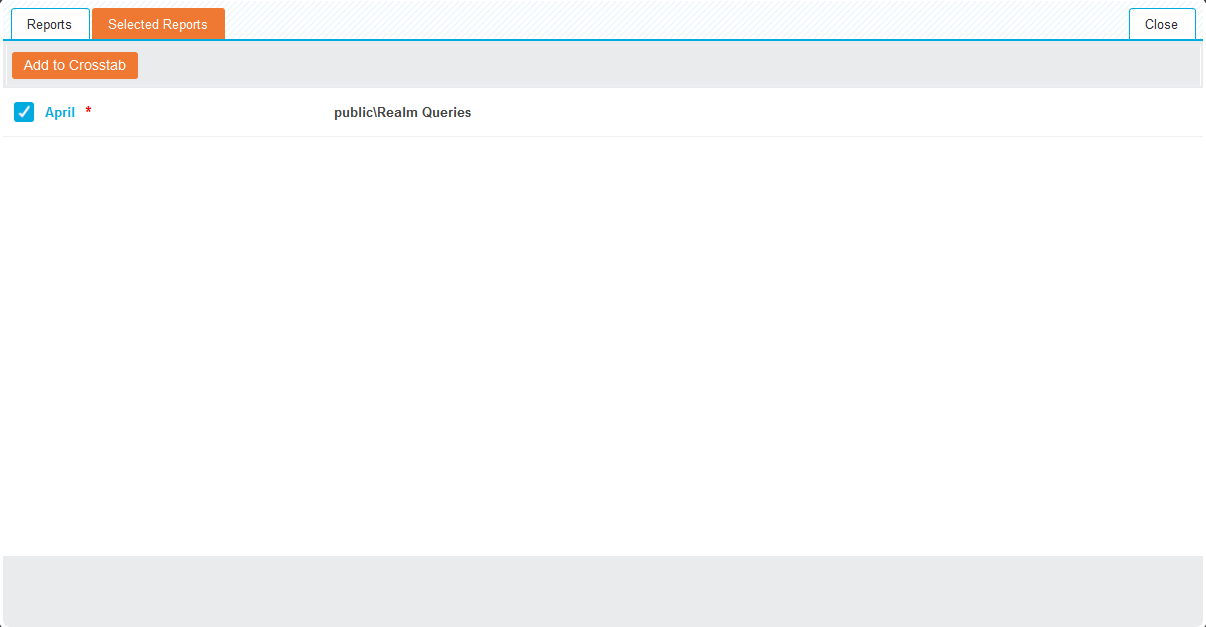
Untick any that are not required and click Add to Crosstab to import the checked reports.
Tip: When using a saved query for a Crosstab column or row, the displayed value is the Name of the saved query. It is also possible to use the description of the saved query as the displayed value of the query.
Note: As the fields are selected, a preview of the Crosstab is generated at the bottom left of the screen. This preview does not show the actual data, but displays any formatting or layout settings you may have created.
To delete all selections for a row or column click None next to the drop-down list. To remove individual fields, click the X icon next to the relevant field.
Adding two or more row or column entries allows multiple fields to be nested into a single Crosstab. Selected entries can be ordered by dragging the entries into the required order, and the underlying data can be sorted by clicking the arrow icon. The fields are sorted in ascending order when the arrow points upwards, and are sorted in descending order when pointing downwards.
The Switch Axis button on the bottom swaps all the values currently selected as rows and columns.
For further field options, click the ellipsis (…) next to the relevant fields to open a pop-up window with the following tabs.
Tip: If changes are made, the ellipsis icon will turn white.
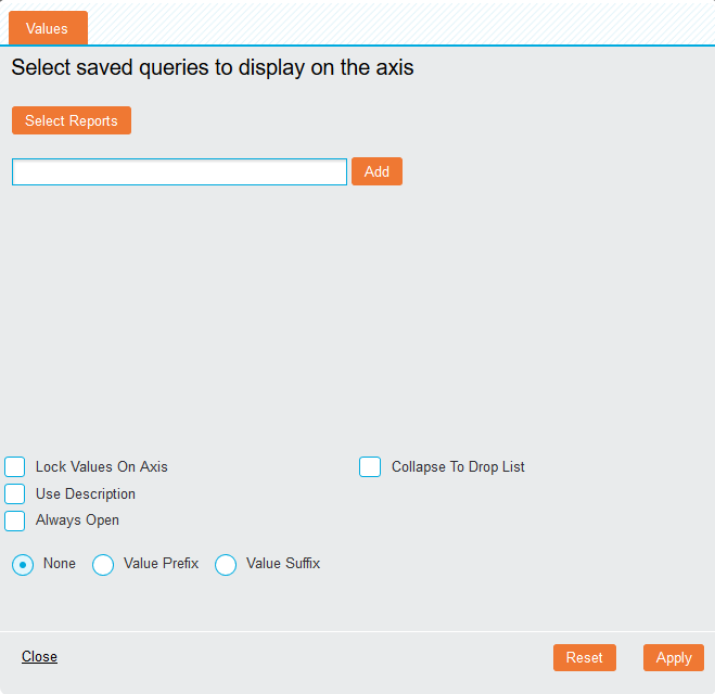
Values
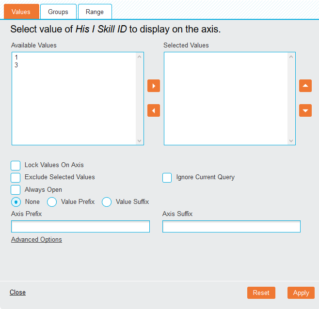
This tab allows the selection of individual values within a field. By default, all values are loaded and displayed on the specified axis. To select certain values, use the left and right arrows in the middle to move the desired fields from the Available Values panel to the Selected Values panel. Re-order fields by using the up and down arrow icons to the right.
The following options are available:
- Lock Values On Axis (checkbox): By default, only values that contain data will displayed in a Crosstab. Checking this option will display headings even if there is no data present. The cells will appear blank but will populate if associated data is inserted into the Index.
- Exclude Selected Values (checkbox): Selecting this option changes the function of the Selected Values column, omitting rather than displaying the selected fields.
- Always Open (checkbox): When displaying data in nested rows, this option will result in permanent visibility for the field, even when the other fields are collapsed. Fields are collapsed when the Show Rows Hierarchically, Show Columns Hierarchically, Group Rows or Group Columns options are enabled in the 'Table' section of the Layout tab.
- Collapse to Drop List (checkbox): This is available for rows only and it displays row values in a drop list rather than the standard table view.
- Ignore Current Query (checkbox): Select this to include values that are currently filtered out by a query.
- Value Prefix/Suffix (radio buttons): Selecting one of these generate the value names as either a prefix or suffix to their respective values in the Crosstab and can be removed by using the None radio button.
- Axis Prefix/Suffix: To display a custom prefix or suffix, enter the required text in these fields.
Advanced Options
It is also possible to replace the values with images by defining the following:
- Image URL textbox: Specify the image directory, ensuring that the image names match the field names. Within the URL, %% will be replaced by the value.
- Missing Image URL: Specify the image directory for the image that will be used whenever a match is not found.
- Widht/Height: Specify the image size, in pixels.
Groups
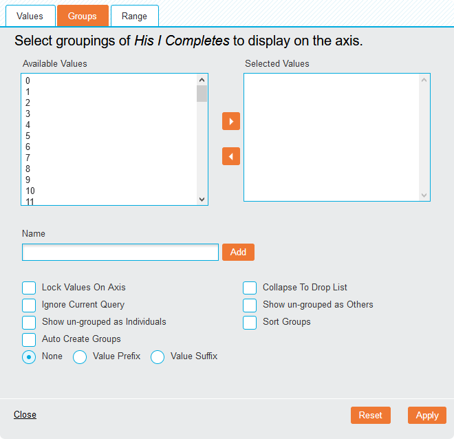
This tab allows multiple row or column values to be grouped together. To create a group, use the left and right arrows in the middle to move the desired fields from the Available Values panel to the Selected Values panel. Then type in a group Name and click Add.The group is displayed below.
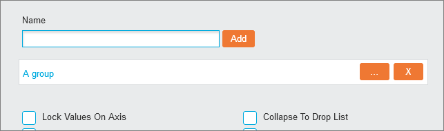
To edit a group, click the ellipsis (…) button next to it. To remove a group, click the X icon.
The following options are available:
- Lock Values On Axis (checkbox): By default, only values that contain data will displayed in a Crosstab. Checking this option will display headings even if there is no data present. The cells will appear blank but will populate if associated data is inserted into the Index.
- Collapse To Drop List (checkbox): This is available for rows only and it displays row values in a drop list rather than the standard table view.
- Ignore Current Query (checkbox): Select this to include values that are currently filtered out by a query.
- Show un-grouped as Others (checkbox): Individual values can be grouped together as ‘Others’ if the option is checked.
- Show un-grouped as Individuals (checkbox): Individual values can be displayed as they are if the option is checked.
- Sort Groups (checkbox): When displaying both groups and individual values, this option forces the values to sort alphanumerically.
- Auto Create Groups (checkbox): Groups can also be created automatically with this option selected. Specify the number of Groups or Values per group and click Create Groups to automate the process.
Range
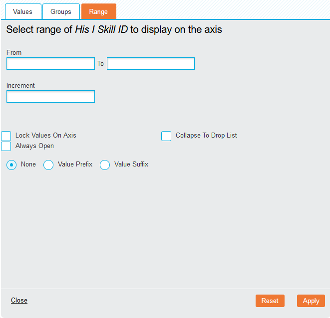
The Range option can be used for any numeric or date fields to display a customised number of entries. Enter the required starting point in the From field, the ending point in the To field and the required increment in the Increment field.
The following options are available:
- Lock Values On Axis (checkbox): By default, only values that contain data will displayed in a Crosstab. Checking this option will display headings even if there is no data present. The cells will appear blank but will populate if associated data is inserted into the Index.
- Always Open (checkbox): When displaying data in nested rows, this option will result in permanent visibility for the field, even when the other fields are collapsed. Fields are collapsed when the Show Rows Hierarchically, Show Columns Hierarchically, Group Rows or Group Columns options are enabled in the 'Table' section of the Layout tab.
- Collapse to Drop List (checkbox): This is available for rows only and it displays row values in a drop list rather than the standard table view.
To save your changes, click the Apply button on the bottom.
To revert any changes to the default values, click the Reset button.
To discard your changes, click Close.