The button control is used to provide the user with a mechanism for initiating an action, eg saving a record.

The standard button has the following properties:
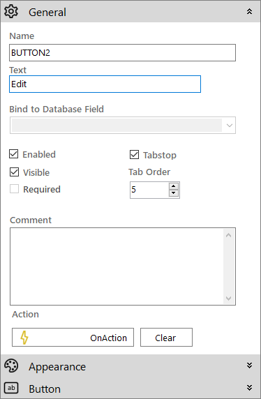
 General
- Name: The name of the control
- Text: Used to set the text on the control
- Visible (checkbox): Specifies whether the control is initially visible or not
- Enabled (checkbox): Specifies whether the control is initially enabled or not
- Tab Order: Sets the tab order for the control
- Tab stop (checkbox): It must be enabled in order for the control to be included in the tabbing sequence
- Comment: Allows you to add details of the control use, which will be output to any documentation produced
- OnAction: Allows you to define a function to run when the control's Events are triggered. Click Clear to remove this function.
Appearance

- Style: Allows you to select a style defined in the Style Editor
- Font: Allows you to define the font used for the text
- Tooltip: The text to be displayed when you hover the mouse over the control
- Background Colour: The background colour of the control
- Foreground Colour: The text colour
- Is right-to-left: Inverts the writing direction allowing you to type from the right to the left.
Button

- Alignment: The horizontal alignment of the text shown on the control (Left, Centre or Right)
- Vertical alignment: The vertical alignment of the text shown on the control (Top, Middle, Bottom)
- Content Text: The base text which can be used to update the displayed text if there is a translatable element in the text string
- Image: Click the icon
 to add an image to the button through the Image Selector.
 - Image alignment: Define where the image will be shown on the button
- Auto size image: If enabled, the button image will be resized to fit the size of the control
- Show as flat: When checked, the button will be styled as a flat button. Otherwise it will appear as a standard button with a 3D effect.
- Flat border colour: The border colour for a flat-styled button
- OnClick border colour: The border colour when a flat-styled button clicked
- OnClick back colour: The background colour when a flat-styled button clicked
- OnClick fore colour: The text colour when a flat-styled button clicked
- OnHover border colour: The border colour when a flat-styled button is hovered with the mouse
- OnHover back colour: The background colour when a flat-styled button is hovered with the mouse
- OnHover fore colour: The text colour when a flat-styled button is hovered with the mouse