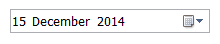
The DatePicker control is used to allow the user to select a date.
The standard DatePicker has the following properties:

 General
- Name: The name of the control
- Start Date/Time: The initial date/time the control will be shown with. Time is available only when the TIME option is selected on the 'Format' property.
- Bind to Database Field: Used to map the control to a database field
- Enabled (checkbox): Specifies whether the control is initially enabled or not
- Visible (checkbox): Specifies whether the control is initially visible or not
- Required (checkbox): Makes the control required so the user has to make an input
- Tab stop (checkbox): It must be enabled in order for the control to be included in the tabbing sequence
- Tab Order: Sets the tab order for the control
- Comment: Allows you to add details of the control use, which will be output to any documentation produced
- OnAction: Allows you to define a function to run when the control's Events are triggered. Click Clear to remove this function.
Appearance
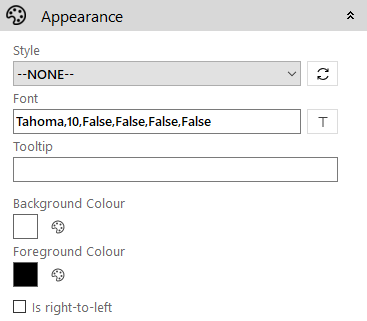
- Style: Allows you to select a style defined in the Style Editor
- Font: Allows you to define the font used for the text
- Tooltip: The text to be displayed when you hover the mouse over the control
- Background Colour: Allows you to set the background colour of the control
- Foreground Colour: Allows you to set the text colour
- Is right-to-left: Inverts the writing direction allowing you to type from the right to the left
Date Picker
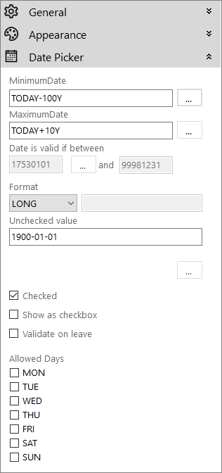
- MinimumDate: The earliest date the user is able to select
- MaximumDate: The latest date the user is able to select
- Date is valid if between: This allows you to check for a valid date, within a specific range, using the required property on screen exit.
- Format: The display format for the date. It can be one of the following:
CUSTOM - This allows you to specify the display format
Formatting codesCode Description d
The day number
dd
The two-digit day single-digit day values are preceded by a 0
ddd
The three-character day-of-week abbreviation
dddd
The full day-of-week name
h
The hour in 12-hour format
hh
The two-digit hour in 12-hour format, single digit values are preceded by a 0
H
The hour in 24-hour format
HH
The two-digit hour in 24-hour format,single digit values are preceded by a 0
m
The minute value
mm
The two-digit minute value, single digit values are preceded by a 0
M
The month number
MM
The two-digit month number, single digit values are preceded by a 0
MMM
The three-character month name abbreviation
MMMM
The full month name
s
The second value
ss
The two-digit seconds value, single digit values are preceded by a 0
t
The one-letter AM/PM abbreviation (AM is displayed as “A”)
tt
The two-letter AM/PM abbreviation (AM is displayed as “AM”)
y
The one-digit year (2001 is displayed as “1”)
yy
The last two digits of the year (2001 is displayed as “01”)
yyyy
The full year (2001 is displayed as “2001”)
Note: For a full list of the date and time formatting options please refer to http://msdn.microsoft.com/en-us/library/8kb3ddd4%28v=vs.110%29.aspx.
- DATETIME - Preset to show "dd MMM yyyy HH:mm"
- FULL - Preset to show "dd/MM/yyyy HH:mm:ss"
- LONG - Defaults to the windows settings for the long date format
- SHORT - Defaults to the windows settings for the short date format
- TIME - Shows as a time picker
- Unchecked value: The value to be returned by the control if its not checked
- Checked (checkbox): When enabled it shows a checkbox to "enable" the datepicker for user input
- Show as checkbox (checkbox): It is used to show or hide the checkbox on the datepicker
- Validate on leave (checkbox): When checked it will trigger any date validation when the user attempts to navigate off the control
- Allows Days (checkboxes): Allows you to specify the days of the week that can be selected. It just needs to be a list of values MON, TUE, WED, THU, FRI, SAT, SUN for each day you wish to allow.
Build Date dialog
Clicking on the ellipsis (…) button alongside a date field throughout the DatePicker properties brings up this dialog.

This allows you to specify a variable based on adding, or subtracting, a number of days, weeks, months or years from the current date, or a fixed date. In the case of the minimum and maximum dates you can specify that there is no limit by selecting the None radio button, which will use the following system defaults:
- Minimum Date: 1st January 1753
- Maximum Date: 31st December 9998