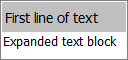
Expand Text
The Expand Text control is used to show text that can be expanded when clicked.
The standard Label has the following properties:
 General
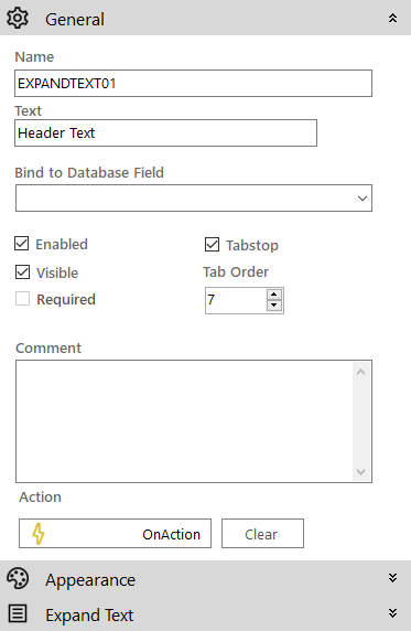
- Name: The name of the control
- Text: The text on the control
- Bind to Database Field: Used to map the control to a database field
- Enabled (checkbox): Specifies whether the control is initially enabled or not
- Visible (checkbox): Specifies whether the control is initially visible or not
- Required (checkbox): Makes the control required so the user has to make an input
- Tab stop (checkbox): It must be enabled in order for the control to be included in the tabbing sequence
- Tab Order: Sets the tab order for the control
- Comment: Allows you to add details of the control use, which will be output to any documentation produced
- OnAction: Allows you to define a function to run when the control's Events are triggered. Click Clear to remove this function.
Appearance
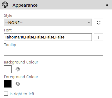
- Style: Allows you to select a style defined in the Style Editor
- Font: Allows you to define the font used for the text
- Tooltip: The text to be displayed when you hover the mouse over the control
- Background Colour: Allows you to set the background colour of the control
- Foreground Colour: Allows you to set the text colour
- Is right-to-left: Inverts the writing direction allowing you to type from the right to the left
Expand Text

- Image: The background image to be displayed in the control. Click the
 icon to access the Image Selector dialog box.
 - Off image: The image to be shown when the control is collapsed. Click the icon to access the Image Selector dialog box.
- Border Colour: The colour of the border around the control
- Border Width: The width of the surrounding border
- Content Back Colour: The background content of the expanded text section
- Context: The text to be displayed when the control expands