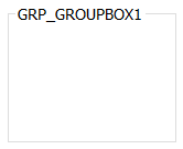
The GroupBox control is used to provide a container for other controls, with a Title in the top left hand corner.
The standard GroupBox has the following properties:
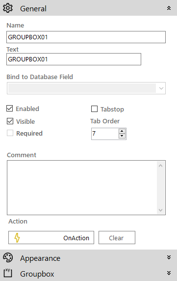
 General
- Name: The name of the control
- Text: The text on the control
- Enabled (checkbox): Specifies whether the control is initially enabled or not
- Visible (checkbox): Specifies whether the control is initially visible or not
- Tab stop (checkbox): It must be enabled in order for the control to be included in the tabbing sequence
- Tab Order: Sets the tab order for the control
- Comment: Allows you to add details of the control use, which will be output to any documentation produced
- OnAction: Allows you to define a function to run when the control's Events are triggered. Click Clear to remove this function.
Appearance
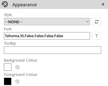
- Style: Allows you to select a style defined in the Style Editor
- Font: Allows you to define the font used for the text
- Tooltip: The text to be displayed when you hover the mouse over the control
- Background Colour: Allows you to set the background colour of the control
- Foreground Colour: Allows you to set the text colour
Groupbox
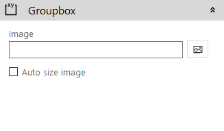
- Image: Allows you to define a background image for the control. Click the Add Image
 icon to access the Image Selector dialog box.
 - Auto size image (checkbox): If enabled the image will size itself to fit in the control