The HotSpot control is used to make an area of the screen respond to a click event. This can be used if you have a background image with “buttons” that the user could use to navigate with.

The standard HotSpot has the following properties:
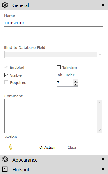
 General
- Name: The name of the control
- Enabled (checkbox): Specifies whether the control is initially enabled or not
- Visible (checkbox): Specifies whether the control is initially visible or not
- Tab stop (checkbox): It must be enabled in order for the control to be included in the tabbing sequence
- Tab Order: Sets the tab order for the control
- Comment: Allows you to add details of the control use, which will be output to any documentation produced
- OnAction: Allows you to define a function to run when the control's Events are triggered. Click Clear to remove this function.
Appearance
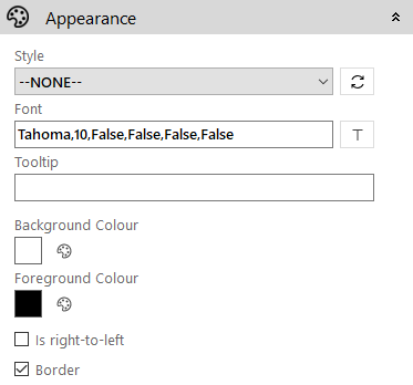
- Style: Allows you to select a style defined in the Style Editor
- Font: Allows you to define the font used for the text
- Tooltip: The text to be displayed when you hover the mouse over the control
- Background Colour: The background colour of the control
- Foreground Colour: The text colour
- Is right-to-left: Inverts the writing direction allowing you to type from the right to the left
- Border (checkbox): Turns on and off a border around the edges of the screen
Hotspot
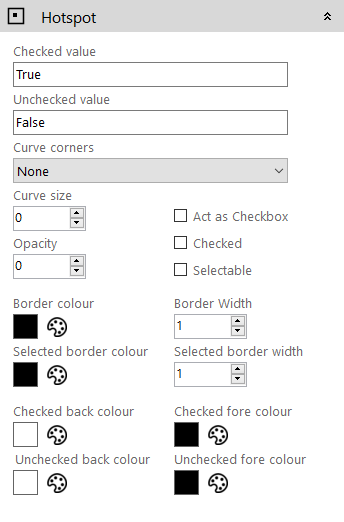
- Checked Value: This sets the returned value for the control when the state is Checked
- Uncheck Value: This sets the returned value for the control when the state is Unchecked
- Curve Corners: Allows you to define which corners are drawn as curved
- Curve Size: This defines the size of the curve
- Opacity: This allows you to specify how opaque the control will be, from 0 (Transparent) to 100 (Full Colour)
- Act as Checkbox:
- Checked:
- Selectable:
- Border Colour: This sets the colour of the border
- Selected Border Colour:
- Border Width: This sets the width, in pixels, of the border
- Selected Border Width:
- Checked Back Colour: This sets the HotSpot background colour when the state is Checked
- Unchecked Back Colour: This sets the hotspot background colour when the state is Unchecked
- Checked Fore Colour: This sets the HotSpot background colour when the state is Checked
- Unchecked Fore Colour: This sets the hotspot background colour when the state is Unchecked
Keyboard navigation
Except of the mouse control you can also use the following keyboard keys for hotspot control:
- <Tab> key to move the focus between different hotspot controls
- <Space Bar> to activate the selected hotspot (enable its OnClick action).
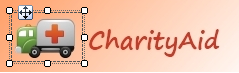
Example: Here is an example of using a HotSpot to overlay an area of the screen which is displaying a watermark image. You can define a function to run when the Click event is generated as the user hovers and clicks the HotSpot defined on top of the ambulance.