The Image control is used to display an image within the script. It also can be used to show a graphical checkbox (Off Image property).

The standard image has the following properties:
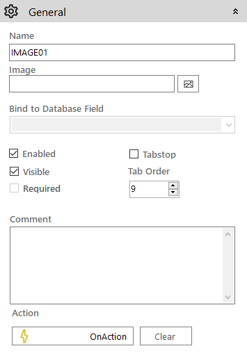
 General
- Name: The name of the control
- Image: To select the image to be displayed for the control click the Add Image the
 icon to open the Image Selector dialog. The same image will be used for the Checked state of the control.
 - Enabled (checkbox): Specifies whether the control is initially enabled or not
- Visible (checkbox): Specifies whether the control is initially visible or not
- Tab stop (checkbox): It must be enabled in order for the control to be included in the tabbing sequence
- Tab Order: Sets the tab order for the control
- Comment: Allows you to add details of the control use, which will be output to any documentation produced
- OnAction: Allows you to define a function to run when the control's Events are triggered. Click Clear to remove this function.
Appearance
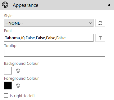
- Style: Allows you to select a style defined in the Style Editor
- Font: Allows you to define the font used for the text
- Tooltip: The text to be displayed when you hover the mouse over the control
- Background Colour: Allows you to set the background colour of the control
- Foreground Colour: Allows you to set the text colour
- Is right-to-left: Inverts the writing direction allowing you to type from the right to the left
Image]
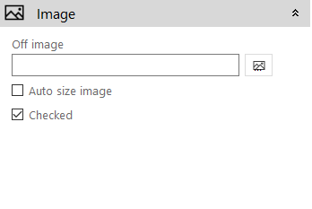
- Off image: The image to be shown when the control is in the Unchecked state. Click the Add Image icon to access the Image Selector dialog box.
- Auto size image (checkbox): If enabled the image will size itself to fit in the control
- Checked (checkbox): Sets the initial “checked” state for the control