The Label control is used to display a text string to the user.

The standard Label has the following properties:
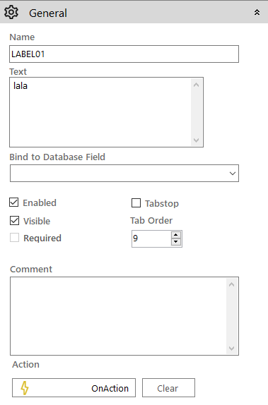
 General
- Name: The name of the control
- Text: Used to set the text on the control
- Bind to Database Field: Used to map the control to a database field
- Enabled (checkbox): Specifies whether the control is initially enabled or not
- Visible (checkbox): Specifies whether the control is initially visible or not
- Tab stop (checkbox): It must be enabled in order for the control to be included in the tabbing sequence
- Tab Order: Sets the tab order for the control
- Comment: Allows you to add details of the control use, which will be output to any documentation produced
- OnAction: Allows you to define a function to run when the control's Events are triggered. Click Clear to remove this function.
Appearance

- Style: Allows you to select a style defined in the Style Editor
- Font: Allows you to define the font used for the text
- Tooltip: The text to be displayed when you hover the mouse over the control
- Background Colour: Allows you to set the background colour of the control ('Transparent' checkbox should be disabled)
- Foreground Colour: Allows you to set the text colour
- Transparent: When ticked it disables the 'Background Colour' property removing it from the control
-
Is right-to-left: Inverts the writing direction allowing you to type from the right to the left
Label
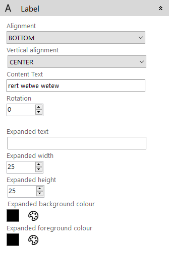
- Alignment: The horizontal alignment of the label's text (Left, Center or Right)
- Vertical Alignment: The vertical alignment of the label's text (Top, Middle or Bottom)
- Content Text: The base text which can be used to update the displayed text if there is a translatable element in the text string
- Rotation: The number of degrees the label will be rotated by
- Expanded Text: The text to be shown when the control is expanded
- Expanded Width: The new width the control will be set to once it is expanded
- Expanded Height: The new height the control will be set to once it is expanded
- Expanded Background Colour: The background colour of the control when it is expanded
- Expanded Foreground Colour: The text colour of the control when it is expanded