The Listbox control is used to allow the user to select an option from a list.
The standard Listbox has the following properties:
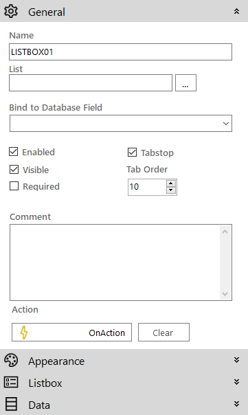
 General
- Name: The name of the control
-
List: Clicking the ellipsis button next to this property opens the List Selector pop-up window to map the control to a list. Alternatively you can manage these lists on the List Editor screen.
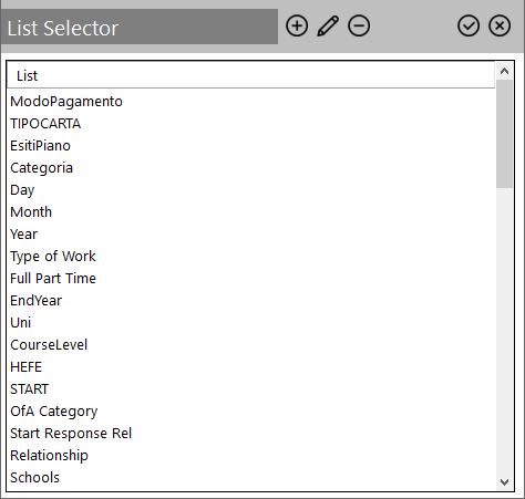
List Selector
The List Selector pop-up window allows you to build and manage lists for use in the screen controls that apply. To quickly use a list on the parent control's property select it and click the
 icon. Clicking the 'List' label sorts the list items switches their sorting between ascending and descending alphabetical order.
For each list, the following actions are available through the icons on the top:
Icon Description 
Adds a new list by providing its name and items

Allows you to modify the details of the selected list 
Deletes the selected list List details

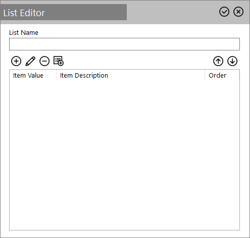
For each list you can customise its items through the following actions:
Icon Description
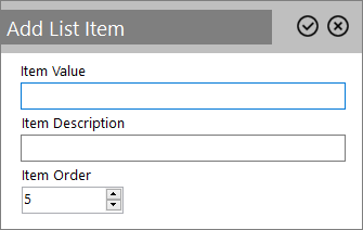
Adds a new list item through a dialog box.

Fill in the required parameters and then click the
icon.
Edits the selected list item. Click the icon to confirm.
Deletes the selected list item.
Warning: No confirmation is requested for the deletion.

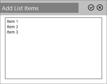
Instead of adding individual list items you can use this icon to provide multiple list items as follows:
-
You can either provide a list of items, which will use the same text for both the value and description

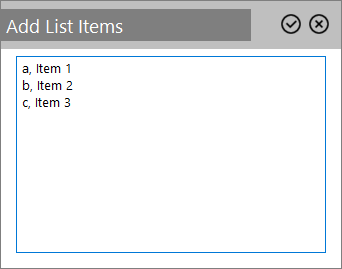
-
Or you can type a comma separated list with the first text for value and the text after the comma for the description


These icons change the order of the list items within the list -
- Bind to Database Field: Used to map the control to a database field
- Enabled (checkbox): Specifies whether the control is initially enabled or not
- Visible (checkbox): Specifies whether the control is initially visible or not
- Required (checkbox): Makes the control required so the user has to make an input
- Tab stop (checkbox): It must be enabled in order for the control to be included in the tabbing sequence
- Tab Order: Sets the tab order for the control
- Comment: Allows you to add details of the control use, which will be output to any documentation produced
- OnAction: Allows you to define a function to run when the control's Events are triggered. Click Clear to remove this function.
 Appearance
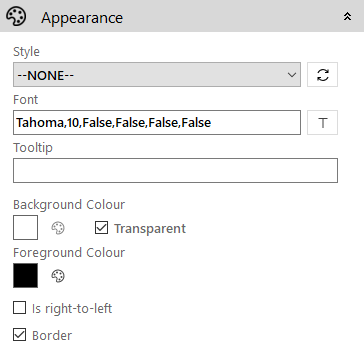
- Style: Allows you to select a style defined in the Style Editor
- Font: Allows you to define the font used for the text
- Tooltip: The text to be displayed when you hover the mouse over the control
- Background Colour: Allows you to set the background colour of the control ('Transparent' checkbox should be disabled)
- Foreground Colour: Allows you to set the text colour
- Transparent: When ticked it disables the 'Background Colour' property removing it from the control
-
Is right-to-left: Inverts the writing direction allowing you to type from the right to the left
- Border (checkbox): Turns on and off a border around the edges of the screen
Listbox
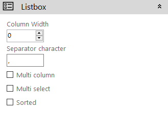
- Column Width: The width of the list column(s) in pixels
- Separator Character: The character used to separate the string of options you are given when querying the value of a listbox (comma by default)
- Multi Column (checkbox): When enabled, the items of the list are spread across multiple columns with a horizontal scrollbar
- Multi Select (checkbox): Specifies whether or not the control will allow the user to select more than one option from the list. To select multiple items, press and hold the CTRL button whilst selecting an item.
- Sorted (checkbox): When enabled, the list will be sorted alphabetically ignoring the ordering set in the list
Data
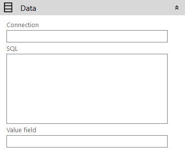
-
Connection: The connection string to be used to connect to the database. It can be left empty if using the project database.
-
SQL: The query used to retrieve data from the database
- Value Field: The field/fields from the SQL query that will be shown when querying the value of the control