NumericSelector
The NumericSelector control is used to allow the user to provide a numeric value.
The standard NumericSelector has the following properties:
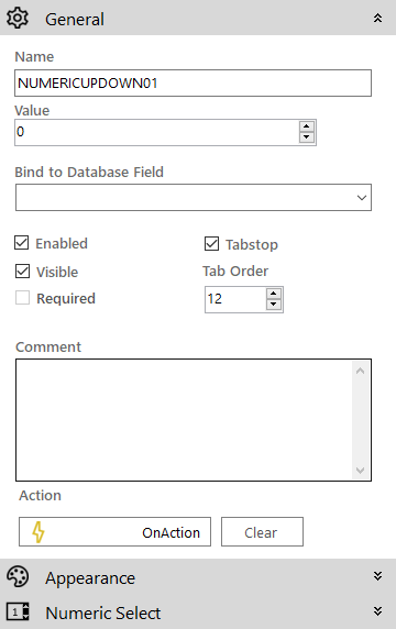
 General
- Name: The name of the control
- Value: The default value of the control
- Bind to Database Field: Used to map the control to a database field
- Enabled (checkbox): Specifies whether the control is initially enabled or not
- Visible (checkbox): Specifies whether the control is initially visible or not
- Tab stop (checkbox): It must be enabled in order for the control to be included in the tabbing sequence
- Tab Order: Sets the tab order for the control
- Comment: Allows you to add details of the control use, which will be output to any documentation produced
- OnAction: Allows you to define a function to run when the control's Events are triggered. Click Clear to remove this function.
Appearance

- Style: Allows you to select a style defined in the Style Editor
- Font: Allows you to define the font used for the text
- Tooltip: The text to be displayed when you hover the mouse over the control
- Background Colour: Allows you to set the background colour of the control ('Transparent' checkbox should be disabled)
- Foreground Colour: Allows you to set the text colour
- Transparent: When ticked it disables the 'Background Colour' property removing it from the control
-
Is right-to-left: Inverts the writing direction allowing you to type from the right to the left
Numeric Select

- Alignment: The alignment of the displayed number in the control (Left, Center or Right)
- Minimum: The minimum allowed number for the control (0 being the default)
- Decimal Places: The number of decimal places to be allowed
- Numeric Step: The step that the current control value will be increased or decreased by when the up or down arrows will be clicked respectively.
- Auto Select Value (checkbox): If set, the current input text will be selected so it can be typed over