The Panel control is used to provide a container for other controls.

The standard Panel has the following properties:
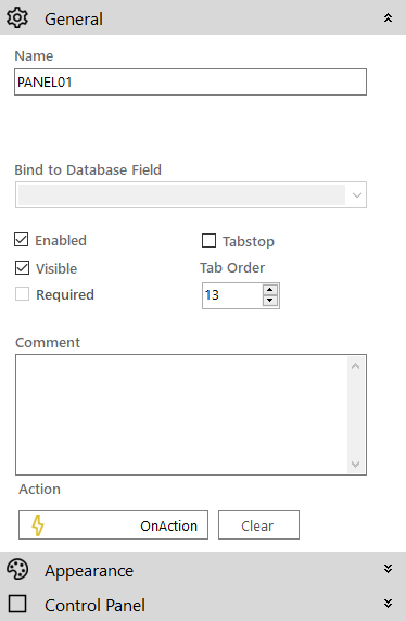
 General
- Name: The name of the control
- Enabled (checkbox): Specifies whether the control is initially enabled or not
- Visible (checkbox): Specifies whether the control is initially visible or not
- Tab stop (checkbox): It must be enabled in order for the control to be included in the tabbing sequence
- Tab Order: Sets the tab order for the control
- Comment: Allows you to add details of the control use, which will be output to any documentation produced
- OnAction: Allows you to define a function to run when the control's Events are triggered. Click Clear to remove this function.
Appearance
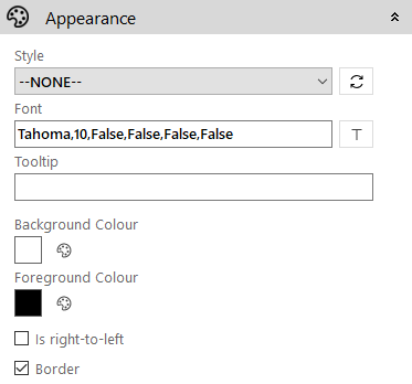
- Style: Allows you to select a style defined in the Style Editor
- Font: Allows you to define the font used for the text
- Tooltip: The text to be displayed when you hover the mouse over the control
- Background Colour: The background colour of the control
- Foreground Colour: The text colour
- Is right-to-left: Inverts the writing direction allowing you to type from the right to the left
- Border (checkbox): Turns on and off a border around the edges of the screen
Control Panel
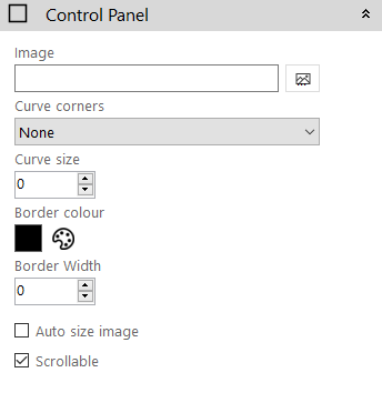
- Image: Allows you to define a background image for the control. Click the Add Image
 icon to access the Image Selector dialog box.
 - Curve Corners: Select the type of curve for the control's borders
- Curve Size: Select the size of curve (in pixels) for the control's borders
- Border Colour: The colour of the control's border
- Border Width: The width (in pixels) of the control's border
- Auto Size Image (checkbox): If enabled the image will size itself to fit in the control
- Scrollable (checkbox): The Panel control allows you to place other controls outside of its "visible" bounds. If this is enabled, then the Panel will display scrollbars to enable navigation to any of the controls outside the "visible" bounds.