The TabControl allows you to have several “pages” of text and data capture grouped together in logical blocks. Once you have added a TabControl to the screen you will need to access the context menu by right-clicking on it and selecting Tab Management> Add Tab, to be able to add controls.
The images below show the TabControl after being added to the screen, and then after having a Tab added.

 Tab selection rules
The following selection rules for editing tab contents and properties apply:
| Clicking area | Condition | Action | Properties displayed |
|---|---|---|---|
| Tab label (A) | Another tab label (B) was selected | Tab label A is selected displaying its contents in the tab page | Tab control properties |
| Tab page was selected |
|
||
| Tab page(background) | – | The tab page of the previously selected tab label is selected | Tab page properties |
| Tab page (visible control) | – | The control is selected | Tab control properties |
Tab actions
Tab related actions are available through right-clicking on the tab area as follows:
| Context menu action | Applicable right-click area | Description |
|---|---|---|
| Add Tab | Anywhere (tab label or tab page) | Adds a new tab to the control |
| Remove Tab | Tab page | Removes the currently displayed tab |
| Move Left | Tab page | Swaps the currently displayed tab with the one on its left |
| Move Right | Tab page | Swaps the currently displayed tab with the one on its right |
| Clone | Anywhere (tab label or tab page) | Creates an exact copy of the currently displayed tab after the last one on the right |
Properties
The standard TabControl has the following properties:


General
- Name: The name of the control
- Default Tab(main TabControl only): Specifies which tab should be selected as default
- Enabled (checkbox): Specifies whether the control is initially enabled or not
- Tab stop (checkbox): It must be enabled in order for the control to be included in the tabbing sequence
- Tab Order: Sets the tab order for the control
- Comment: Allows you to add details of the control use, which will be output to any documentation produced
- OnAction: Allows you to define a function to run when the control's Events are triggered. Click Clear to remove this function.
Appearance
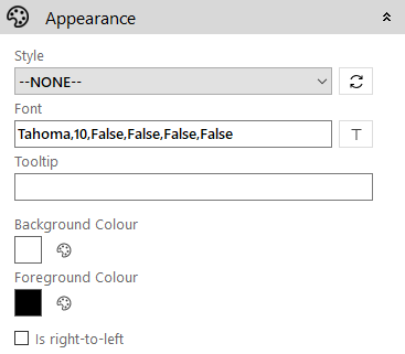
- Style: Allows you to select a style defined in the Style Editor
- Font: Allows you to define the font used for the text
- Tooltip: The text to be displayed when you hover the mouse over the control
- Background Colour: The background colour of the control
- Foreground Colour: The text colour
- Is right-to-left: Inverts the writing direction allowing you to type from the right to the left.
Tab

- Show Tab Outline (checkbox): When disabled, no border nor background colour are shown on the unselected tab label(s)
- Border Colour: The colour of the border line around the whole tab control
- Selected Tab Backcolour: The background colour for the selected tab label
- Selected Tab Forecolour: The text colour for the selected tab label
- Unselected Tab Backcolour: The background colour for the unselected tab label(s)
- Unselected Tab Forecolour: The text colour for the unselected tab label(s)
Tab Page

- Image: Allows you to define a background image for the tab page. Click the
 icon to access the Image Selector dialog box.
 - Auto size image (checkbox): If enabled, the selected image will be resized to fit the size of the tab page
- Tab Image: Allows you to define an icon to be displayed on the left of the tab label. Click the icon to access the Image Selector dialog box.