The TextBox control is used to capture a text response from the user.

The standard TextBox has the following properties:

 General
- Name: The name of the control
- Text: Used to set the text on the control
- Bind to Database Field: Used to map the control to a database field
- Enabled (checkbox): Specifies whether the control is initially enabled or not
- Visible (checkbox): Specifies whether the control is initially visible or not
- Tab stop (checkbox): It must be enabled in order for the control to be included in the tabbing sequence
- Tab Order: Sets the tab order for the control
- Comment: Allows you to add details of the control use, which will be output to any documentation produced
- OnAction: Allows you to define a function to run when the control's Events are triggered. Click Clear to remove this function.
Appearance
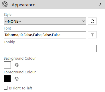
- Style: Allows you to select a style defined in the Style Editor
- Font: Allows you to define the font used for the text
- Tooltip: The text to be displayed when you hover the mouse over the control
- Background Colour: Allows you to set the background colour of the control
- Foreground Colour: Allows you to set the text colour
- Is right-to-left: Inverts the writing direction allowing you to type from the right to the left
Textbox
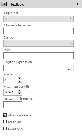
- Alignment: The text alignment within the control (Left, Center, Right)
- Allowed Characters: Allows you to specify which characters can be typed into a TextBox control. Format of restriction is [(list of accepted character)] i.e. [A-Z a-z]
- Casing: Auto sets the casing of the text, options are: None, Upper, Lower and Proper
- Mask: Controls the kind of character that can be entered at each position of the input.
- Regular Expression: This allows you to run a regular expression on the TextBox to check the input matches for example checking the email address is formatted correctly
- Minimum length: The minimum number of characters that must be entered
- Maximum Lenth: You can restrict the amount of data the user can type in by setting this property. This property will be set automatically if you bind the TextBox to a database field, where the length of the field is known.
- Password Character: If you want to hide the input from the user the TextBox can be set to show a single masking character. This is set by defining the mask character in this property.
- Allow Cut/Paste (checkbox): Enables/disables support for cut/paste of the text in the control
- Multi Line (checkbox): The standard TextBox only allows a single line of text to be captured. By enabling this property you can define a height for the control for entering multiple lines of text.
- Read Only (checkbox): When enabled, the text of the control cannot be modified