Edit Mode
Flow Report Wizard
The Wizard is designed to quickly walk you through the Flow Report design process through a series of tabs.
 Report tab
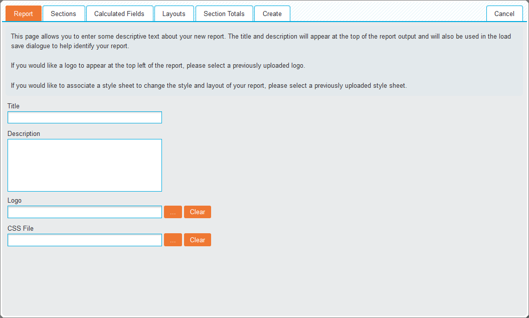
This tab allows you to enter some descriptive text about your new report.
- Title: The title that will appear at the top of the report and will be used as the report identifier in the Load screen.
- Description: The description that will appear at the top of the report and will be used as the report identifier in the Load screen.
- Logo: Click the ellipsis (…) icon next to the textbox to load an image that will be displayed at the top of the report. Clicking Clear removes the selected logo.
- CSS File: Click the ellipsis (…) icon next to the textbox to select a previously configured style sheet and enhance the report beyond the standard styling options. Clicking Clear removes the selected CSS file.
Sections tab
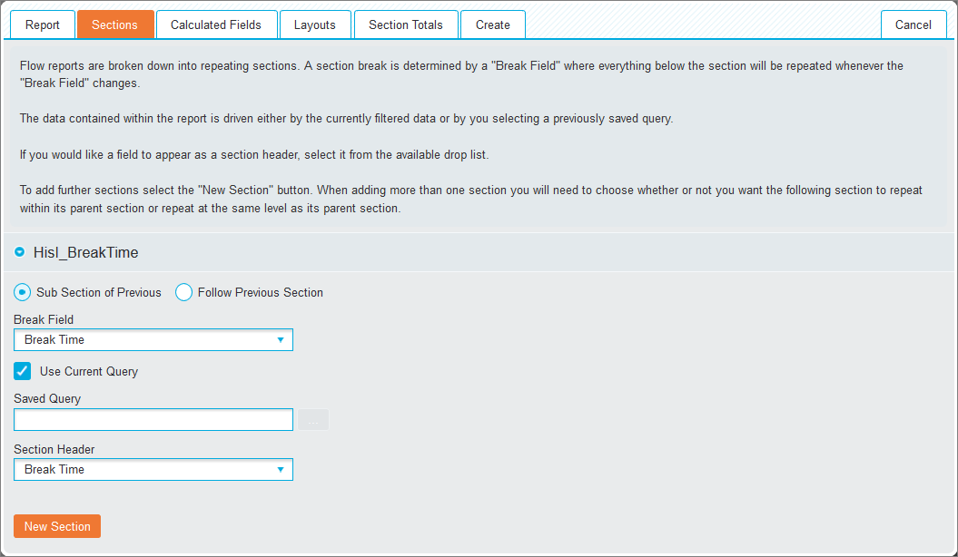
Flow Reports consist of multiple repeating sections separated by Break Fields. Specifying a break field will split the displayed data, allowing multiple results to be separated across the report.
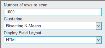
- Break Field (drop-down list): Select the required field for splitting the data.
- Current Query (checkbox): If enabled, will import what is currently in the query bar. If disabled you can select a saved query.
- Saved Query: When Current Query checkbox is deselected click the ellipsis (…) icon next to the textbox to load a previously generated query.
- Section Header (drop-down list): Select the required field to display a field as a section header within each report break.
- New Section: Add another section. This shows the following radio buttons for selecting one of them:
- Sub Section of Previous: The additional section can repeat within its parent section
- Follow Previous Section: The additional section can repeat at the same level as its parent section
Calculated Fields tab
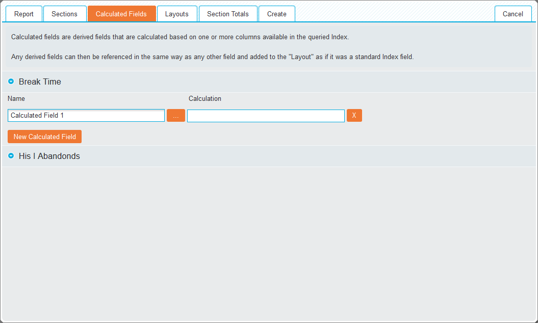
This tab allows you to create one or many calculated fields to output in the table of results. Click New Calculated Field to reveal the creation options.
- Name: Label the calculation and click the ellipsis (…) icon to enter the calculation (see Calculations for more information). To delete an added calculation, click the X icon.
Layouts tab
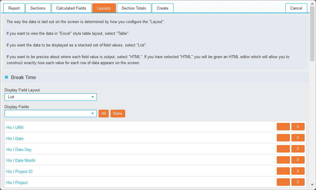
This tab provides a number of options to customise how the report is displayed.
- Display Field Layout (drop-down list): Alter the layout of the data by selecting one of the following:
- Table: To display data in a spreadsheet style
- JSON: To output the data as a JavaScript Object Notation syntax
- List: To display the data as a stacked set of field values
- HTML: This option allows further layout and appearance configuration through the editor tool
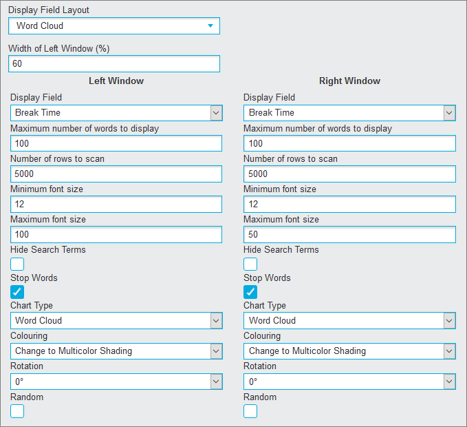
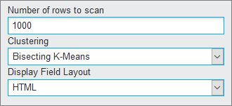
Word Cloud: To visualise the word frequency in a given text as a weighted list. Additional settings appear.

Clustering
 Section totals tab
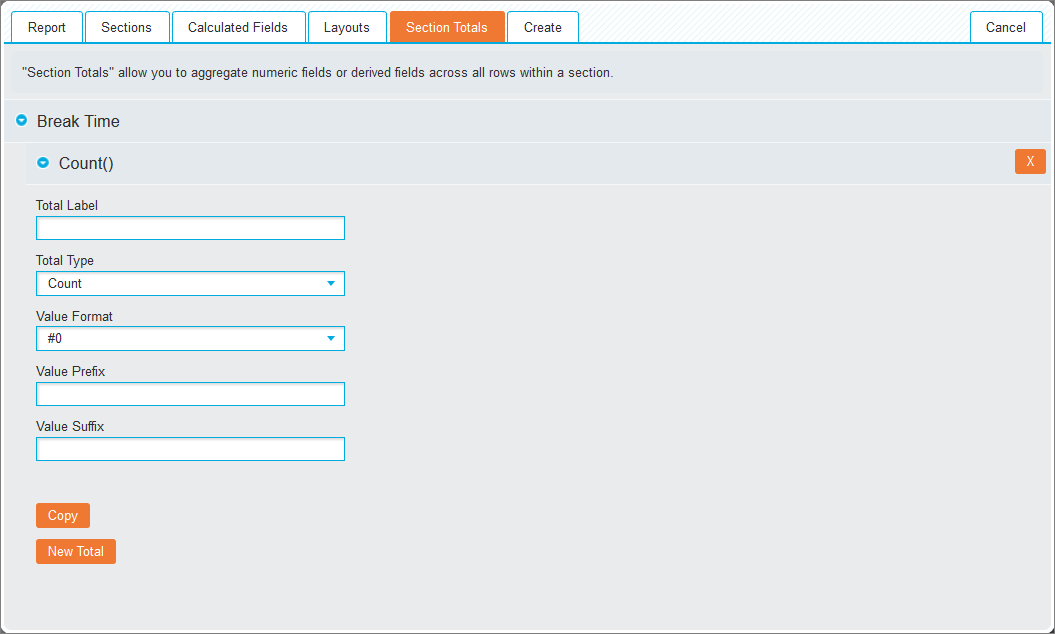
This tab allows you to aggregate numeric fields for use as totals at the end of each section. Section totals are configured in the same way as Crosstabs vtotals.
After finishing your configuration click Create (tab) to apply all configuration options and return to Edit mode.
Manual Flow Report Creation
Manage Layout
To manually create a Flow Report, the layout and elements can be modified using the following options:
Sections
To add a new section in the Edit mode click the Create Section  icon, then click the new <Select Field> placeholder to reveal the Section Properties pop-up window.
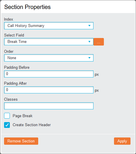
The following parameters are available:
- Index (drop-down list): Select an available index that the field will be taken from.
- Select Field (drop-down list): Specify the field to be used. Click the ellipsis (…) icon to further configure the Values, Groups and Range. Please refer to Crosstabs for further information regarding these options.
- Order (drop-down list): Specify if the data will be displayed in either Ascending or Descending order. Select None to defeat this option.
- Padding Before/ After: Enter a numerical value to apply spacing before or after the section.
- Classes: Set the styles based on any uploaded CSS files. If inputting multiple class names, separate them with a space.
- Page Break (checkbox): Enable this option to ensure that each subsequent section of the report will output onto a single page when output as a PDF file.
- Create Section Header (checkbox): This option specifies if the field will be used as the section header text.
When all options have been set, click Apply to save changes and return to Edit mode.
The <Select Field> placeholder will now be renamed to the name of the specified field. Clicking the field reopens the Section Properties pop-up window for editing. Click again Apply to save changes or Remove Section to delete the section.
Parent sections are coloured green, the first child is coloured blue and the second child pink.
Adding a Sub Section
To manually add a new Sub Section, equivalent to the Sub Section of Previous option in the wizard, split the existing section window and click the Create Section icon.
Split and Merge Windows
A new Flow Report is initially created as a single window allowing a single component to be added. By splitting and merging windows, a customised layout can be created. The following actions are available:
| Icon | Action | Description |
|---|---|---|
|
Split | The window is split into separate windows. To control how many windows are created, click the arrow to the right of the icon, specify the number of rows and columns by using the + and - icons and click Split. |
    |
Merge | Click one of this icons to merge two windows together. The direction of the arrow indicates which way the windows will be merged. |
Tabs
It is possible to create multiple tabs for an entire Flow Report or for individual components.
| Icon | Action | Description |
|---|---|---|
|
Switch to Tab Layout |
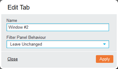
Displays the tab options for the Flow Report. The current view will be titled "Window #1". To rename a tab, right-click it to open the Edit Tab pop-up box.
Click Apply to complete renaming. |
| + | Add tab |
Creates additional tabs "Window #2", "Window #3", etc. Navigate between created tabs by clicking their names. |
|
Switch to Grid Layout | Removes all associated tabs and returns to the grid view |
To delete an individual tab, drag it to the Remove Reports section at the top of the screen.
Report Components
You can directly manipulate report components in order to create your flow report. Please refer to the Report Components for a detailed breakdown of the available components.
Add Component to canvas
To add a component to the report, drag the relevant icon from the Add Reports toolbar onto the canvas. Alternatively, click 'DROP' in the canvas and select the icon from the resulting pop-up.

Remove Component
To remove a component, drag it from the canvas to the Remove Reports section at the top of the screen.
Combine components in canvas
Drag an added component on top of another added component on the canvas reveals a variety of options:
- Swap: Switches the locations of the components
- Replace: Moves the dragged component to the location of the other component, deleting it in the process
- Split Horizontally/ Vertically: Displays the two components in the same window, splitting the view accordingly.
Switch between components
When you drag the Crosstab icon (from the toolbar) onto an existing Chart component in the canvas or the Chart icon onto an existing Crosstab in the canvas the Switch To option appears allowing you to change one into another.
Copy/Move component
When a component is dragged from a Canvas window into an empty window, click Copy to duplicate it in the destination window or click Move to change the location of the component.
Options
The Flow Report options are displayed in the following tabs:
Layout tab
Style Options
- Size (drop-down list): Change this to Custom to specify the Flow Report size in pixels, allowing the creation of a larger or smaller Flow Report than the detected screen resolution.
- Minimum Size: Specify this in pixels to ensure the Flow Report will only display at certain resolutions.
- Size with filter panel (checkbox): If Minimum Size is specified then this option becomes available to include the Filter Panel in the dimensions of the Flow Report.
Report Options
- Enable Drill Through(checkbox): This allows the toggling of the drill through functionality when the Flow Report is in Run mode. This is especially useful used in conjunction with the Report Viewer functionality, where limiting the visibility of the underlying data is required.
- Automatically Refresh: Enter a value (in seconds) greater than 0 to automatically refresh a Flow Report at this frequency.
Clicking Add New Tab will add a tab to the Flow Report without leaving the options screen.
Ticker tab
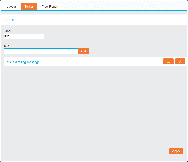
The Ticker tab allows the entry of rolling text to display at the top of the Flow Report while it is in Run mode.
- Label: Add a name
- Text: Enter the required text and click Add to complete the process.
To edit an entry, click the ellipsis (…) icon or click the X icon to delete it.
If there are multiple entries, each line will be scrolled through in turn.
Flow Report tab
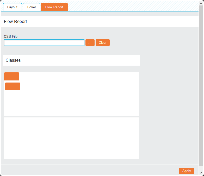
This tab allows you to enhance the report beyond the standard styling options.
- CSS File: Click the ellipsis (…) icon next to the CSS File textbox to select a previously configured style sheet. Click Clear to remove the uploaded file.
- Classes: The white boxes under the Classes heading reflect the layout of the current Flow Report. Click one of the sections to reveal the Classes textbox below, allowing each section to be assigned any number of classes. Selected sections will turn blue.
Click Apply to close the pop-up window and apply your changes.