Report Components
The following components can be added to Pages reports or Flow Reports through the toolbox in Edit mode:
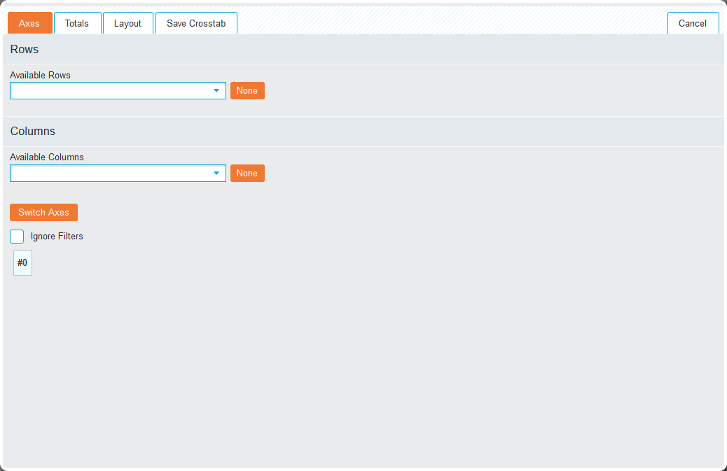
Crosstab

When adding a Crosstab, the following options are available:
 Load Existing
Add a previously created crosstab to the report through the 'Saved Reports' window. Click the checkbox next to the relevant report will load it.
If a Crosstab is loaded that contains both a table and a chart one of the following options will appear:
- Split Crosstab: Halves the window, placing the table in one section and the chart into the other
- Ignore Chart: Loads only the Crosstab table onto the report.
Link Existing
Add a previously created Crosstab through the 'Saved Reports' window. Clicking the checkbox next to the relevant Crosstab loads it and updates it to reflect any changes to the source Crosstab.
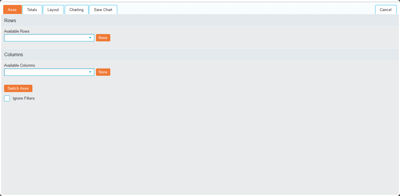
Chart

When adding a chart, the following options are available:
Create New
Navigates you to the Crosstab interface with the addition of the 'Charting' tab.
Once the relevant options have been set, click Save Chart to add it to the current report. Alternatively, click the Save  icon in the menu bar to save it for future use.
Load Existing
Add a previously created chart to the report through the 'Saved Reports' window. Click the checkbox next to the relevant chart will load it into the report.
If a Crosstab is loaded that contains both a table and a chart one of the following options will appear:
- Split Crosstab: Halves the window, placing the table in one section and the chart into the other
- Ignore Table: Loads only the chart onto the report.
Link Existing
Add a previously created chart through the 'Saved Reports' window. Clicking the checkbox next to the relevant Crosstab loads it and updates it to reflect any changes to the source Crosstab.
Gauge

When adding a gauge, the following option is displayed:
Create New
Displays the gauge creation screen that contains the following tabs: 'Axes', 'Totals', 'Layout', 'Gauge' and 'Save Gauge'.
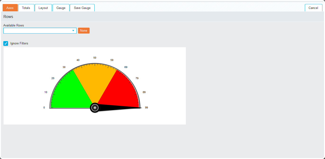
Axes
Select the rows used to create the gauge using the Available Rows drop-down list.
Totals
Specify one or more aggregations using the 'Aggregation' options and click the 'Colour Bands' tab to manually change or add additional Colour bands to the gauge.
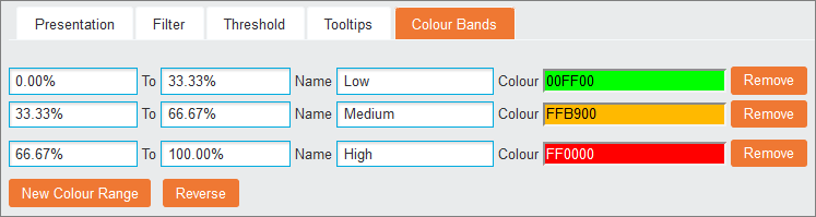
By default, a gauge is created with three colour bands split into even percentages or whole values labelled Low, Medium and High. Change the percentages using the first two textboxes and change the label by completing the Name textboxes. Click New Colour Range to add an additional colour band and reverse all bandings based on their percentages by clicking Reverse.
Gauge
In this tab, the display options are set. The preview at the bottom of the tab will update after every change.
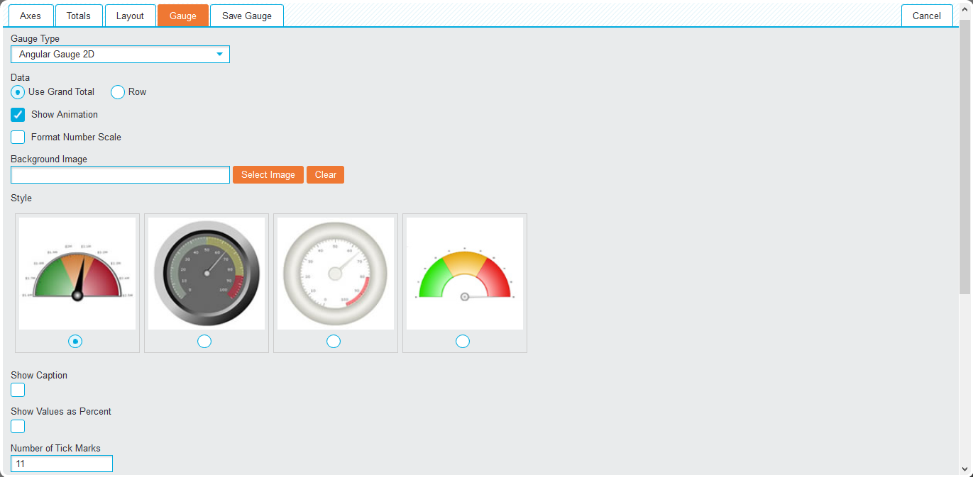
- Gauge Type (drop-down list): Select which gauge will be used to visually represent the data.
- Total (drop-down list): When multiple totals are present, select the total that will be used for the gauge.
- Data (radio buttons): Select one of the following:
- Use Grand Total: Measure the grand total of the rows
- Row: Measure the specific row out of the grand total. Selecting Row will present an additional drop-down list to allow the choice of row to measure against.
- Show Animation (checkbox): Allows the toggling of the gauge loading animation.
- Format Number Scale (checkbox): If enabled, it will represent thousands as K and millions as M.
- Background Image: To display an image behind a gauge click Select Image to load the image to be used. Click Clear to remove the selected image.
- Style: Select one of the available visual styles for the gauge.
- Show Caption (checkbox): Check to display the row name above the gauge.
- Show Values as Percent (checkbox): Check to display percentages rather than actual values.
- Number of Tick Marks: Alter the number of displayed markers by entering a value in the textbox.
- Advanced Options: Gives you access to the Trends functionality. Click New Trend and enter the trend values in the first two textboxes. The Name field allows the addition of a label and the Colour field is used to define a specific colour by either typing the hex code or using the pop-up colour picker.
Once all options have been set, click Save Gauge to add it to the report.
Query

Adding a saved Query to a report allows search results from a specific query to be displayed.
Query options
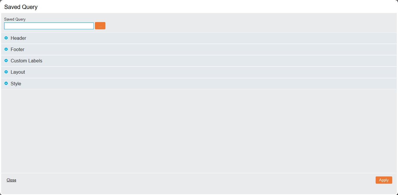
The Saved Query screen is displayed when this component is added, allowing the 'Header', 'Footer', 'Custom Labels', 'Layout' and 'Style' options to be set. Click the ellipsis (…) icon to open the Saved Reports screen, where clicking the checkbox next to the relevant query will load it. Click Apply to complete the process.
Venn Diagram

The Venn diagram component allows a previously saved interactive diagram to be added to a report.
Select Venn diagram
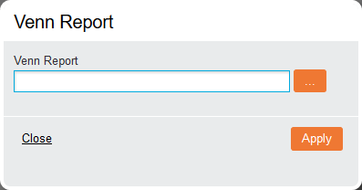
Click the ellipsis (…) icon after adding the component to load the Venn, then click Apply to complete the process.
Text / HTML Pages

After adding the Text component to a report, the text editor is displayed.
Text Editor
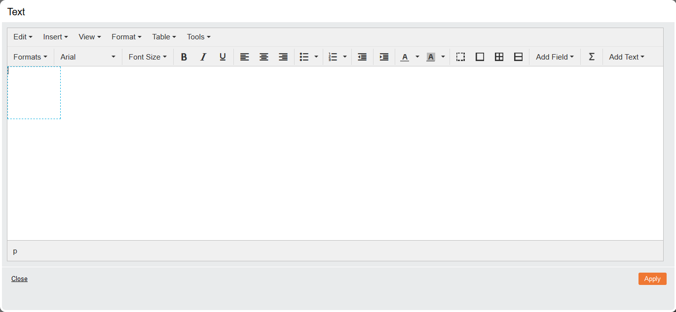
To change to the HTML editor, click Tools then <> Source Code. Click OK to save changes made in this window.
Once the required content has been written, click Apply to save.
Embed External Entity

This component allows files that have been imported to be displayed on a report. The permitted file types are set by the system administrator.
Add Embed External Entity
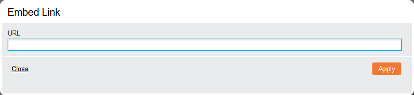
Enter the link in the URL field and click Apply to complete the process. Addresses do not need to be prefixed with http:// as this is added automatically.
Note: Although you can embed images using the Embed External Entity element, it is recommended that you use the HTML content element instead. HTML content can be dynamically resized and positioned anywhere within the element, whereas Embed External Entity retains the images’ dimensions and does not automatically scale to different screen sizes.
Link To External Page

The Link component allows an external URL to be embedded onto the dashboard.
Add Lint to External Page
Once this component has been added, the 'Saved Reports' window will open. Click the checkbox next to the required file to complete the process. When the report is run, the active page will load and is fully accessible.
CXForm

This component allows you to add a saved form to a Pages report for completion and report integration.
CXForm options
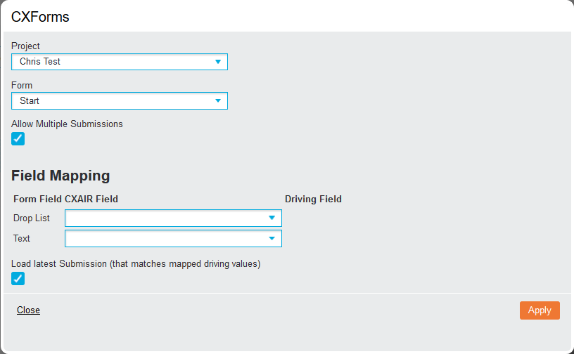
- Project (drop-down list): Select the project
- Form (drop-down list): Select the form to add
- Allow Multiple Submissions (checkbox): Enable this to open the form to more than one response.
- Field Mapping fields: A drop-down list is shown for each field in the form, allowing the relevant fields to be pre-populated with data from the currently loaded index.
- Load Latest Submission (checkbox): Enable this to ensure the latest data is loaded
Click Apply to save changes and display the form. Then resize the component to a size big enough to display the form, and click Run to display the form.
Placeholder

When creating multi-component Pages reports, the Placeholder component is a useful tool that allows users to position empty components on the grid. These can be moved and resized to establish the desired layout before components are added in place.
Once added and resized, the Placeholder can then be replaced by other components. Drag the required component on top of the Placeholder to replace it with the desired component.
Map
Note: This feature requires administrator setup before it becomes available. If not configured, the icon will not be active.
When added to a report, the Mapping options are displayed.
Map options
- Map Type (drop-down list): Select the map that will be plotted, with the default option set to Google Maps.
- Map (drop-down list): Select the saved map choosing between the previously configured maps made available by the administrator.
- Saved Query: Select a query that will filter the data to be mapped. Click Select Query to open the 'Saved Reports' window and click the checkbox next to the required query to load it.
- Centre Map Position (drop-down list): Define the starting position of the map. Select Custom and enter Latitude and Longitude values to specify an exact location.
- Initial Zoom (drop-down list): Specify the level of zoom that will be applied to the map when first loaded, with the higher numbers zooming out further.
- Map Type (drop-down list): Specify how the Google Map will be displayed, with each offering a different level of detail.
- Spot Type (drop-down list): Allows you to alter how the points will be displayed on the map
- Dot: Displays customised colour bands
- Heat: Displays a more intense colour where the data has higher values or density
- Relative: Colours spots based on the colour banding options while representing the counts with automatic resizing.
Colour Bands
Click the 'Totals' tab and Advanced Options to display the Colour Bands which applies a map to each Total Type.
- Number of Colour Bands: Enter a number to customise how many colour bands will be applied
- Band: Click this textbox to change the colour by either entering the hex codes using the pop-up colour picker.
- Custom Colour Bands (checkbox): Enable this to further configure the banding options. Alter the splits by entering the value or the desired percentages and apply a custom label using the Name textbox. Click Remove to delete a banding, and Reverse to swap the colours for the bands.
Click the Save Map tab to save changes and add it to the report.
Runtime Map Options
There are several options available when the report is run and a map is added. Click the Hide button to hide the control panel.
- Values tab: Displays all mapped data, the value behind the data and the colour of the dot based on the banding options.
- Measures tab: Displays the colour band configuration for the map.
- Spot Types tab: Allows you to change the display settings without entering Edit mode.