Pages
Pages is the simplest and quickest way of organising charts, tables, lists, commentary and graphics into a professional and stylish report pack. Pages allows you to present data without the visual restrictions of traditional reporting packages, combining the speed of ad hoc analytics with the freedom of traditional publishing and word processing platforms.
To access the Pages functionality, click Pages on the Menu links panel at the top of the screen.
Pages screen is split into two distinct modes:
-
Edit Mode (default): This mode utilises a drag-and-drop interface alongside a floating toolbox for building your pages reports and different tabs for report navigation.
-
Run Mode: This mode displays the created report.
To toggle between Edit and Run mode, click the Run  or Edit
  icon located on the menu bar at the top of the screen.
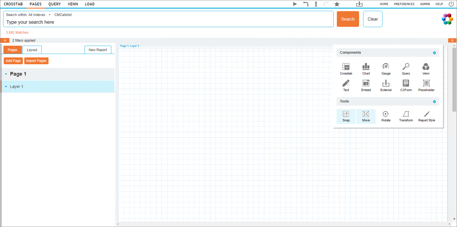
Edit Mode
In this mode you can build your page reports using the following sections :
- Navigation Panel: Allows you to configure the reports
- Toolbox: Shows the available report components and the associated tools
- Page grid: This is the area where you manipulate your page components. Move the cursor over an added component to reveal the sizing arrows and move components by dragging them onto the desired space on the page.
Navigation Panel
Pages reports are configured using the Pages and Layout tabs located on the navigation panel at the left of the screen. Clicking the New Report tab label discards any changes made and returns to a blank page.
Note: If there are one or more Pages templates defined in the Manage Reports screen then a context menu appears with the New Pages Report as the first item and the name(s) of the template(s) following.
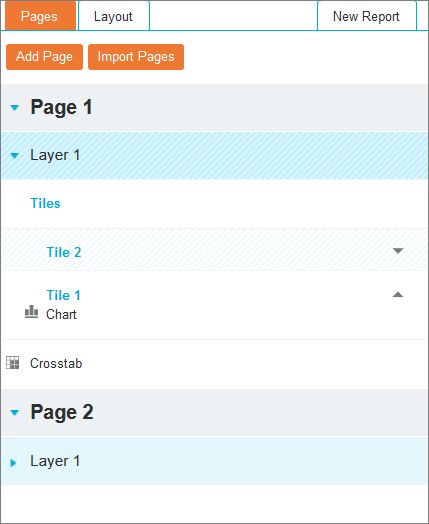
 Pages tab
It lists all current pages, layers and components in an hierarchical way.
Expand pages and layers using the arrow on the left side of a page or layer. Reorder layers within a page using the up and down arrows on the right side of a layer. The higher on the list, the further back the layer is rendered. Layers at the bottom of the list will always be in front of those at the top of the list when the report is in Run mode.
Click an added component to highlight its location on the page and reveal the relevant option in the toolbox.
Add Page
Click Add Page to add an additional page to the report. The new page will automatically be selected and will be blank. To remove an additional page, click it in the list and then click the  icon from the 'Page Options' in the toolbox.
Import Pages
Click Import Pages to import individual pages from other Pages reports and check the required report from the list.
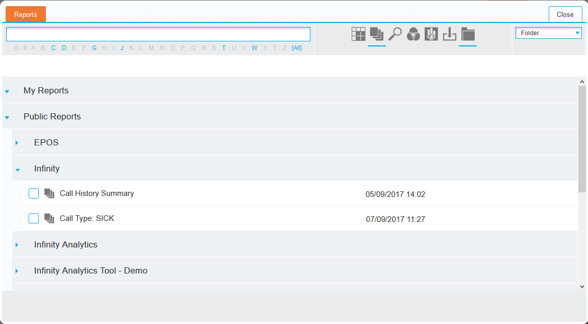
Select the relevant report to be presented with the Import Pages window, where individual pages can be selected. To deselect a page, click it again. Click All to select all pages, or None to deselect every page.
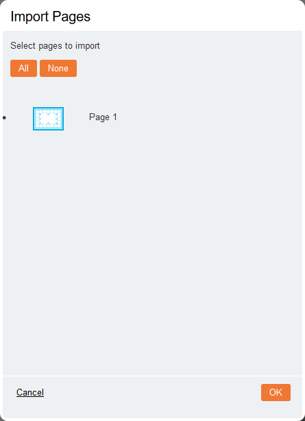
Once the required pages have been selected, click OK to complete the import process.
Layout tab
It allows you to Reorder pages by dragging and dropping them into the correct order providing more configuration options.
Breaking Pages on Fields
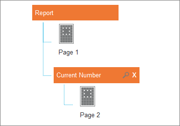
Pages can be broken on different fields from the Index. These breaks are used to create repeating reports that provide details for different aspects of the underlying data. For example, breaking a page by a field such as ‘Method of Payment’ will repeat a page for each payment method.
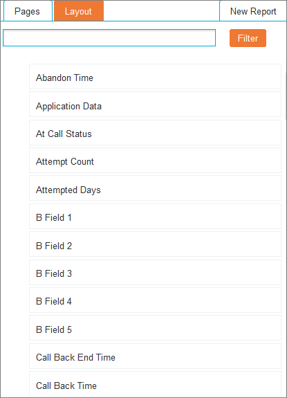
All of the available fields are listed on the left of the screen and can be quickly filtered using the above search bar. Drag a field onto the required page to break it by that field. This will indent the page, indicating that this page is now broken by a field.
To further configure the break, click the magnifying glass icon that is present next to the page name to open the 'Section Properties' dialog box.
- Index (drop-down list): Select the Index that the field is broken from. This option can also be used to report across different Indexes.
-
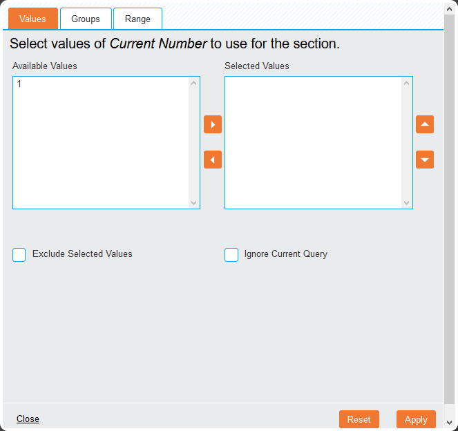
Select Field (drop-down list): Change the field that will be used. To specify the records from the field that will be used, click the ellipsis (…) icon. This will open a pop-up window for specifying the records. Select the tab that will be used to specify the records:
Values tab

This tab allows the selection of individual values within a field. To select certain values, use the left and right arrows to move the desired fields from Available Values to Selected Values. Re-order fields by using the up and down arrow icons.
The following options are available:
- Exclude Selected Values (checkbox): Selecting this option changes the function of the Selected Values column, omitting rather than displaying the selected fields.
- Ignore Current Query (checkbox): Select this to include values that are currently filtered out by a query.
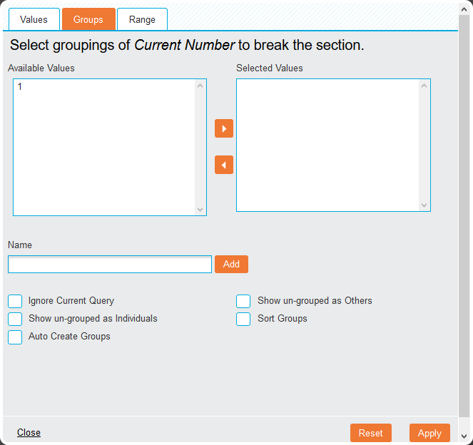
Groups tab

This tab allows multiple row or column values to be grouped together.
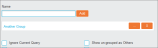
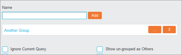
To create a group, use the left and right arrows to move the desired fields from Available Values to Selected Values. Then type in a group Name and click Add.The group is displayed below.
To edit a group, click the ellipsis (…) button next to it. To remove a group, click the X icon.
The following options are available:
- Ignore Current Query (checkbox): Select this to include values that are currently filtered out by a query.
- Show un-grouped as Others (checkbox): Individual values can be grouped together as ‘Others’ if the option is checked.
- Show un-grouped as Individuals (checkbox): Individual values can be displayed as they are if the option is checked.
- Sort Groups (checkbox): When displaying both groups and individual values, this option forces the values to sort alphanumerically.
- Auto Create Groups (checkbox): Groups can also be created automatically with this option selected. Specify the number of Groups or Values per group and click Create Groups to automate the process.
To save your changes, click the Apply button on the bottom.
To revert any changes to the default values, click the Reset button.
To discard your changes, click Close.
- Order (drop-down list): Select either Ascending or Descending order for the selected field. If no order is required, select None.
Toolbox
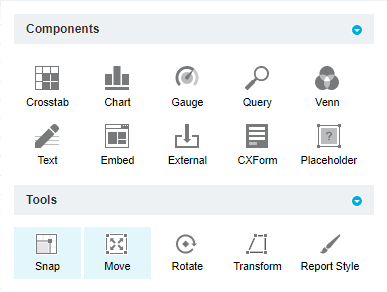
The floating toolbox contains all available report components and the associated tools to visually manipulate the resulting report. The toolbox can be moved anywhere on-screen by clicking and dragging it to the desired location. Its sections can be collapsed using the blue arrow to the right of each heading.
The toolbox can display the following sections depending on your selection on screen. Click any link in the Section column to view more information about it.
| Section | Trigger | Description |
|---|---|---|
| Report Components | Click an empty section of the page grid | Shows the available components that you can add to your report by dragging and dropping them to the required location on the page grid. |
| Interaction Tools | Click an empty section of the page grid | Allows you to define the components' interaction with the page. |
| Component Options |
Click a component on the page |
Reveals various configuration options for the selected component. |
| Page & Layer Options | Click a page or layer name on the navigation panel | Shows options for configuring and styling pages and layers. |
Run Mode
In this mode you can navigate through the report by scrolling down if necessary to reveal the created pages.
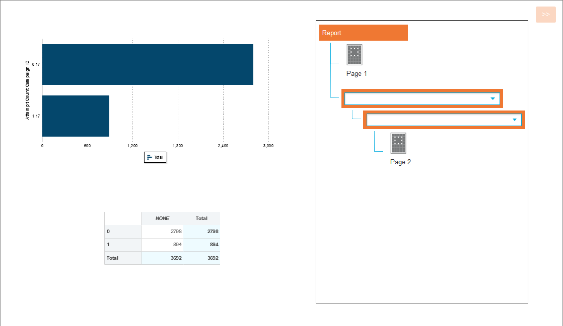
Click the << icon at the top-right of the report to reveal the layout options, where a specific page can be selected. If the report contains pages that are broken by a field, use the relevant drop-down list to select a specific record.
Filters can also be applied to manipulate the displayed data. Click the >> icon at the top-left of the screen to open the filter panel.