The following table present the various controls which you can use to construct your script interface:
| Control Name | Description |
|---|---|
| Browser | Allows you to embed an internet or intranet page into your script |
| Button | Allows you to interact with the script and perform an action when clicked |
| Checkbox | Allows you to capture a yes/no type response |
| Checked ListBox | Allows you to select one or more items from a list |
| Combobox | Allows you to select an entry from a drop-down list |
| DataGridView | Used to display grids of data read from the database |
| DatePicker | Allows you to enter a date or time value |
| Expand Text | Holds a single line of text shown by default that will expand to show additional text when clicked |
| Generic Control | A place holder for a custom .NET DLL that provides additional functionality |
| GroupBox | Allows the user to group a number of controls together in a bordered box |
| HotSpot | Allows the user to define an area of the screen that can perform a click action |
| Image | Allows the user to place a picture on the screen |
| InfoTip | Allows the user to place a small icon on the screen, to display information to the user |
| Label | Allows the user to place non editable text on the screen |
| Listbox | Allows the user to select a single or multiple entries from a list |
| NumericSelector | Allows the user to enter a numeric value |
| Panel | Allows the user to group a number of controls together in a box |
| RadioButton | Allows the user to select a single option from multiple items in a container |
| RichTextBox | Allows the user to display a block of formatted text to the user. As well as displaying static text you can embed database fields and variables |
| TabControl | Allows you to have several “pages” of text and data capture grouped together in logical blocks |
| TextBox | Allows the user to capture a text response |
| Timer | Allows the user to trigger a function based on a regular interval in seconds |
| Webservice | Allows the user to access external processes and harness them within the script, via published Web services |
Control Properties
When working with controls there are two ways to view their properties, the Standard view and the Advanced view. Depending on your settings, the Standard view can be accessed by double-clicking on a control and the Advanced view can be accessed via the Control context menu. To access the context menu of a control, you can right-click any control.
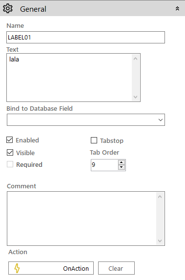
 Basic Property Viewer
The following apply for the basic control properties:
-
They are displayed in a panel on the right side and not in a pop-up window

- All control properties are now visible. Previously only a subset of them (as appeared in the advanced properties) was displayed in the basic properties.
- They are mostly grouped in three or four subpanels:
- General: Contains all the common control properties previously split between sections General, Options and Actions
- Appearance: Contains the same properties the old Appearance section did
- <Control-specific-properties>: Bearing the control's name this panel contains the specific properties for this control
- Data: Contains the required parameters for connecting the control to a database
 Advanced Property Viewer
The advanced property window lists all the available properties for configuring a screen control.
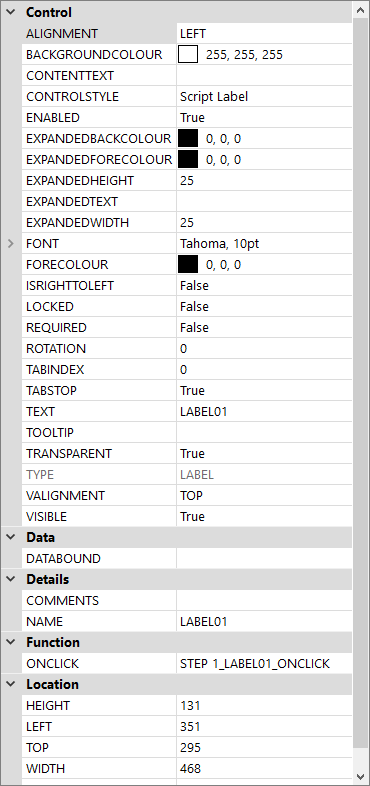
Property values can be changed by clicking on the value and either typing a new value directly into the box or by using whatever selection method (such as a drop-down list) is presented to you. Some properties can be expanded to display more detail.
Common Control Properties
| Property | Description |
|---|---|
|
ALIGNMENT |
This Allows you to define the horizontal alignment of the text shown on the control. Values are Left, Centre or Right |
|
BACKCOLOUR |
This is the background colour for the control |
|
COMMENTS |
Allows you to provide a comment on the control |
|
ENABLED |
Determines whether the control is enabled or disabled |
|
FONT |
Shows the controls font setting |
|
FORECOLOUR |
This is the foreground colour for the control |
|
HEIGHT |
Shows the height of the control |
|
ISRIGHTTOLEFT |
Used to indicate control will be used on a system that reads from Right to Left |
|
LEFT |
Shows the controls “left” position |
|
LOCKED |
Determines whether the control is locked |
|
NAME |
Shows the name of the control |
|
REQUIRED |
Determines if the control is required |
|
TABINDEX |
Shows the controls tab index |
|
TOP |
Shows the controls “top” position |
|
TEXT |
Shows the controls text value |
|
TOOLTIP |
Shows the controls hover over tool tip |
|
TYPE |
Shows the controls Type |
|
VISIBILE |
Determines whether the control is visible or not |
|
WIDTH |
Shows the width of the control |
|
ZORDER |
Shows the controls display order which will be a value of: 1 = Front, 5 = Normal, 9 = Back |
Properties Panel
The following panel actions are available to the vertical toolbar on the right:
| Icon | Description |
|---|---|
|
Clicking it while the side panel is closed opens it to display the properties of the selected screen control. If none is selected then the Screen Properties are shown instead (as if the Screen Properties The icon is inactive when the panel is open. |
|
Switches the panel contents between basic and advanced control properties (not available when Screen Properties are displayed). |
|
Accept your changes closing the panel. |
|
Cancel your changes closing the panel. |
|
Pins the control panel to the screen. This way you can keep a specific control's properties visible even when selecting other controls in the screen editor. |
 icon on the horizontal toolbar at the top was used).